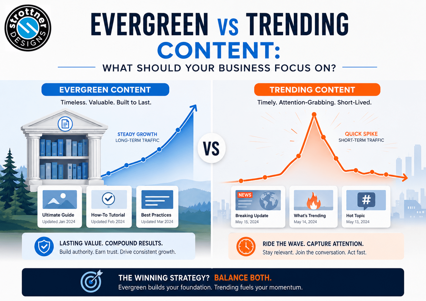
 A lot of businesses start talking about a website redesign the minute the site begins to annoy them.
It feels old. It looks dated. It no longer reflects the business very well. Nobody’s proud to send people to it. The whole thing has started giving off “we haven’t touched this since the Wi-Fi password was still on a sticky note” energy.
That’s fair.
But “we want it to look better” isn’t much of a strategy.
A redesign should absolutely improve the visual side of the site. If your website looks outdated, generic, or like it belongs to a version of the business that no longer exists, that matters. People judge fast. A tired-looking site can make a good business feel less current than it is.
Still, appearance alone isn’t enough.
If a redesign only makes the site prettier, you’ve basically paid for better lighting in a room that still has bad wiring.
Most redesign conversations start with aesthetics, but the real issues usually aren’t just visual. The messaging is too broad. The navigation is clumsy. The service pages are weak. The mobile experience is annoying. The site doesn’t support search very well. The brand and the website don’t feel like they belong to the same company.
That’s the real problem.
A redesign shouldn’t just make the site nicer to look at. It should make the business clearer, stronger, and easier to trust.
This is one of the first things a better site should accomplish.
When someone lands on your website, they should be able to understand what your business does, who it helps, and where to go next without needing a guided tour and emotional support.
A surprising number of websites miss here. They look polished enough, but the message is vague. The homepage says things that sound important without saying much. Service pages drift into broad, professional fog. Visitors leave with a general sense that the company seems competent, but not with a clear sense of what it actually does.
That’s not a design win.
A redesign should improve clarity. Better hierarchy. Better headlines. Better structure. Better service descriptions. Less decorative ambiguity pretending to be sophistication.
If people have to work too hard to understand the business, the site is already underperforming.
A website isn’t a framed brand presentation. It’s a place people are supposed to use.
That means a redesign should improve how people move. Navigation should make more sense. Key pages should be easier to find. Calls to action should show up where they belong. The site should help people move from question to confidence to action without making them feel like they’re wandering through a building with bad signage.
If the new site looks better but still makes visitors dig for services, guess where to click, or wonder what they’re supposed to do next, the redesign didn’t finish the job.
Better flow matters because it affects trust, usability, and conversion all at once.
A website shouldn’t just make a good impression.
It should know what to do with it.
This should be obvious by now, but apparently the internet still needs the occasional reminder.
The phone version isn’t the backup website. For a lot of businesses, it’s the website.
A redesign should improve the mobile experience in a real, noticeable way. Not just technically responsive. Actually better. Easier to read. Easier to tap. Easier to navigate. Easier to trust.
This is where older sites tend to reveal themselves pretty quickly. Desktop may still feel acceptable. Mobile usually tells the truth much faster.
If the redesign doesn’t make the site stronger on phones, then it’s fixing the version the business owner sees in meetings more than the version actual visitors use.
That’s not a great priority structure.
This gets overlooked constantly.
A lot of redesigns pour energy into the homepage because it’s the page everyone looks at first. Fair enough. But many businesses don’t lose opportunities because the homepage is ugly. They lose them because the service pages are weak, generic, buried, or just not doing enough.
A redesign should improve how services are explained. It should help answer obvious buyer questions faster. It should make those pages more specific, more useful, and more aligned with what people actually care about when they land there.
That matters even more if the site is supposed to support SEO and lead generation. In that case, the service pages can’t just sit there in a pressed shirt hoping the blog does all the work.
They need to contribute.
Sometimes a site needs a redesign because the layout is dated.
Sometimes it needs one because the whole business has evolved and the website still looks like an earlier, less confident version of the company.
That’s not just a design issue. That’s a brand issue too.
A redesigned site should feel more aligned with where the business is now. Better work should look like better work. Stronger positioning should feel stronger. More refined services shouldn’t be introduced by a website that still feels broad, generic, or stuck halfway through a previous chapter.
People notice that mismatch.
They may not put it into elegant language. They probably won’t say, “This visual identity appears misaligned with the company’s current stage of growth,” because most people don’t talk like that unless they’ve been trapped in an especially long strategy meeting.
But they feel it.
A redesign should help the website feel like the actual business, not some leftover version of it.
This is where the conversation usually gets more useful.
A redesign should improve actual performance. That might mean stronger conversion paths. Better messaging. Faster loading. Cleaner structure. Better internal linking. Stronger page priorities. Better SEO support. Better usability. Fewer points of hesitation.
In other words, the redesign should make the website more effective.
Not just more presentable.
This is where some redesigns disappoint. They produce a nicer-looking version of the same underlying problems. The typography improves. The spacing improves. The site feels more current. But the weak structure, vague copy, clumsy navigation, and underperforming service pages all remain.
That’s not transformation.
That’s a cosmetic update with good posture.
This is a quieter goal, but an important one.
A strong redesign shouldn’t just solve today’s irritation. It should create a better foundation for what comes next.
That means a structure that can grow. A content system that makes sense. Navigation that doesn’t fall apart the minute two new pages get added. Design choices that feel specific without chasing trends that will age badly by next spring.
A redesign should give the business more room to evolve without needing another rescue mission six months later.
That doesn’t mean trying to predict the next decade of the internet like some caffeinated oracle. It just means building with enough clarity and discipline that the site has a future.
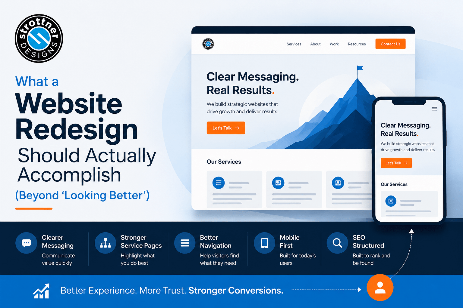
At Strottner Designs, we don’t treat a website redesign like a surface-level makeover.
It should be a business improvement project.
Yes, the new site should look stronger. It should feel more current, more polished, and more aligned with the brand. But beyond that, it should clarify the message, improve the structure, strengthen the service pages, support SEO, work better on mobile, and make the next step easier for the visitor.
Otherwise, it’s just a nicer-looking version of the same confusion.
That’s not really the goal.
The goal isn’t to make the business owner say, “That looks much better.”
The goal is to make them say, “That actually feels like us now, and it works better.”
That’s a much more useful outcome.
A website redesign shouldn’t just change how the site looks.
It should improve how the site communicates, guides, supports, and converts.
Better design matters. Of course it does.
But if “better” stops at appearance, the redesign didn’t go nearly far enough.
Because a stronger website should do more than look updated.
It should make the business easier to believe.
Thinking about a website redesign because the current one no longer feels like the business?
At Strottner Designs, we build redesigns that do more than improve appearance. We help businesses create websites that are clearer, easier to navigate, stronger on mobile, better aligned with the brand, and more effective at supporting SEO and lead generation.
![]()
Interested in a new site and SEO, or just a new site? Visit Home of the Free Website to learn how we can build you a free or affordable site.
Privacy Policy | Sitemap | Terms of Use