 Website navigation is one of those things people barely notice when it’s working well.
They just move.
The site makes sense. The next click feels obvious. They find what they need without stopping to decode the menu like it’s hiding a secret message.
Nobody leaves a site saying, “What an incredible navigation experience.” But they do stay longer, move more naturally, and feel more confident in the business when the site is easy to use.
When navigation goes wrong, though, everyone feels it.
The menu gets crowded. Labels get vague. Important pages disappear under clever wording and unnecessary dropdowns. Visitors start clicking around like they’re looking for a flashlight in a junk drawer. And once that happens, trust starts slipping.
At Strottner Designs, we run into this a lot with new clients. Businesses put real effort into branding, content, and visual design, then treat navigation like the last five minutes of the project. A few menu items get tossed in, someone says “that seems fine,” and the site goes live with the digital equivalent of bad road signage.
That’s a problem, because navigation does more than help people move around. It helps them decide whether your business feels clear, credible, and easy to work with.
And if your website is supposed to generate leads, support SEO, and move visitors toward action, your navigation can’t just exist.
It has to guide.
That’s really the job.
When someone lands on your site, they’re trying to answer a few questions quickly:
What does this business do?
Am I in the right place?
Where should I go next?
How do I find the thing I actually came here for?
A strong navigation system helps answer those questions fast.
A weak one adds friction. It makes visitors interpret labels, guess where pages live, and work harder than they should. That may not sound dramatic, but small hesitation adds up. The more thinking your navigation requires, the more likely people are to leave, backtrack, or start wondering whether the business is as organized as it says it is.
That’s one reason website navigation that converts isn’t really about menu design alone.
It’s about reducing mental effort.
A good site doesn’t make visitors solve a puzzle first.
This is where things go sideways fast.
Navigation labels shouldn’t be cute. They shouldn’t be mysterious. And they definitely shouldn’t sound like a branding workshop got loose on the sitemap.
We’ve seen businesses hide service pages under labels like “Solutions,” “Capabilities,” “Our Approach,” or “What We Do,” and then act surprised when visitors don’t move through the site cleanly.
Sometimes those labels aren’t technically wrong. They’re just less helpful than they should be.
Clear usually beats clever.
If a visitor is looking for your web design services, Web Design is doing a lot more work than Solutions. If they want to contact you, Contact is more useful than Let’s Connect. If they want to learn about your process, Our Process is stronger than some vague label buried in a dropdown.
This isn’t the place to show off.
Navigation is signage.
Good signage gets to the point.
Businesses often organize websites based on how they think about themselves.
Visitors usually don’t care.
That disconnect is where messy navigation often starts.
Internally, a company may think in terms of departments, service categories, or internal process language. But visitors show up with simpler goals. They want a service. They want pricing information. They want examples. They want to know whether they trust you. They want to contact someone without digging through three nested menus like they’ve unlocked a side quest they never asked for.
That means navigation should be structured around what users are actually trying to do, not how the business talks about itself in meetings.
This is one mistake we see often. The company knows exactly what every label means because they made it. The visitor is seeing it cold, and cold navigation needs to be obvious.
A lot of websites overdo it.
Too many menu items. Too many dropdowns. Too many secondary pages in the header. Too many things competing for attention.
The result isn’t flexibility. It’s decision fatigue.
A smaller menu with stronger choices usually works better than a giant navigation system trying to prove how much the company has going on. Most visitors don’t need to see everything at once. They need to see the right things first.
That usually means prioritizing the pages that matter most: core services, about or trust-building content, work or case studies if they’re relevant, resources if they support the journey, and a clear contact or consultation path.
Everything else doesn’t need front-row seats.
A navigation bar isn’t a storage unit.
This sounds obvious, yet here we are.
One of the easiest ways to weaken a website is to bury the pages that actually matter most to the business. Service pages get tucked under vague umbrella menus. Contact information is harder to find than it should be. High-value pages get treated like background material while lower-priority content clutters the top navigation.
That’s backwards.
If a page helps the business win work, answer a key question, or move a visitor toward action, it shouldn’t be playing hide-and-seek.
This is where navigation gets practical. The menu should reflect business priorities clearly. Not every page deserves equal prominence. Some pages are there to support. Some pages are there to lead.
A good navigation system knows the difference.
This isn’t just a user-experience issue.
Navigation also helps search engines understand your site. Clear internal structure, logical hierarchy, and sensible pathways make it easier for Google to understand what matters and how pages relate to each other.
So no, navigation isn’t just a design detail.
It’s part of the site’s strategic structure.
If important pages are buried, unclear, or hard to reach, that affects more than usability. It weakens how clearly the site communicates relevance and hierarchy.
Bad navigation confuses people.
It can confuse search engines too.
Dropdown menus can be useful.
They can also become a junk drawer with hover effects.
A dropdown should help organize related information, not hide half the site in a place people have to carefully navigate with their mouse like they’re defusing something.
If you need one, keep it clean. Group related pages logically. Make the labels clear. Don’t overload it with ten nearly identical choices and assume visitors will happily sort it out.
This matters even more on mobile, where a messy dropdown goes from mildly annoying to actively irritating.
A navigation system that feels manageable on desktop can feel like punishment on a phone.
And if your mobile navigation is annoying, visitors aren’t going to reward your effort with patience and grace. They’re just going to leave.
This is the part businesses miss.
Good navigation isn’t just about helping people roam around the site. It’s about helping the right people reach the right pages at the right time.
That means the navigation should support the actual journey.
Someone new to the business may need to understand services first. Someone further along may want to see work or proof. Someone ready to act may want the shortest path to contact.
A smart navigation system helps all three without turning the site into a maze.
That’s why the best navigation usually feels simple on the surface but strategic underneath. It quietly guides people based on what they’re likely to need next.
That’s very different from “let’s fit all of our pages into the menu somehow.”
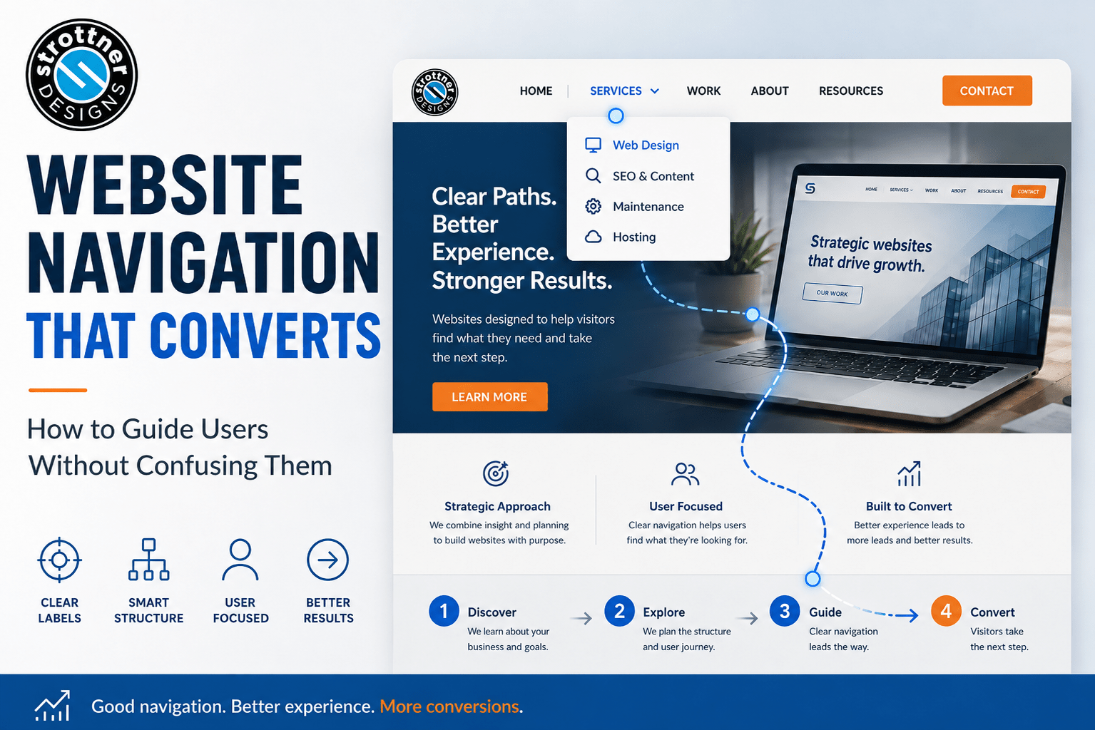
What we recommend at Strottner Designs
At Strottner Designs, we think website navigation should do three things well.
First, it should make the business easier to understand.
Second, it should make important pages easier to find.
Third, it should help move visitors toward action without making them work for it.
That usually means clearer labels, fewer competing choices, stronger page prioritization, and a structure built around user intent instead of internal jargon.
It’s probably not a coincidence that Patrick Strottner, our president, has a degree in electrical engineering. That kind of systems thinking shows up in how we approach websites. We want them to feel organized, logical, and easy to move through, not just beautiful…though, they are that as well!
That mindset also fits naturally with our 5-D Design Process. From Discovery and Development through Design, Decisions, and Delivery, we’re thinking about more than how a site looks. We’re thinking about how people use it, how information should be structured, and how the whole experience should guide visitors toward clarity instead of confusion.
We’re not interested in navigation that looks impressive in a sitemap diagram and then confuses actual humans the second they arrive.
We want navigation that feels easy.
Easy is underrated. Easy converts.
Website navigation should feel less like a map of your company and more like a guide for your visitor.
That’s the difference.
If people have to stop and interpret the menu, the navigation is already asking too much. If important pages are buried, the site is creating friction it doesn’t need. If the structure helps people move naturally from curiosity to clarity to action, then the navigation is doing what it should.
And that’s the goal.
Not more menu items.
Not cleverer labels.
Not bigger dropdowns.
Just a clearer path.
Is your website guiding visitors clearly, or making them work harder than they should?
At Strottner Designs, we build websites that are organized, easy to navigate, and designed to help people find what they need without friction. From clearer structure and stronger page flow to better conversion paths, we help businesses create websites that feel easier to use and easier to trust.
Interested in a new site and SEO, or just a new site? Visit Home of the Free Website to learn how we can build you a free or affordable site.
Privacy Policy | Sitemap | Terms of Use