In 2015, Google changed the game on search engine results by checking if a site was mobile responsive. Quickly dubbed, “Mobilegeddon,” Google’s post started out by stating the reasoning behind the change:
“When it comes to search on mobile devices, users should get the most relevant and timely results, no matter if the information lives on mobile-friendly web pages or apps.”
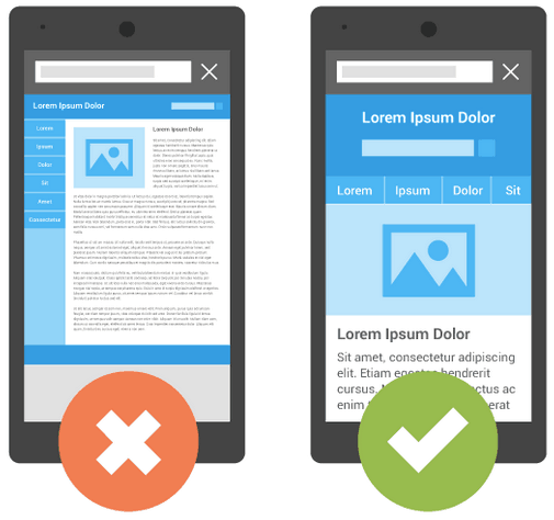
The change was going to be huge, and we announced it to our clients, letting them know that we would analyze their sites for free, and convert to a mobile responsive design at a discounted rate. We would change the site from the one on the left, to the one on the right, improving the user experience:
Our understanding was that mobile-friendliness was about to be a ranking signal, and sites that were not responsive would be punished in the results. It was a simple “yes or no” question, and would require a lot of work.
Not as big as we worried about at the time. Google effectively managed to change the design of a lot of sites and how they present the user experience, in a short amount of time…with the risk of losing their placement if they didn’t comply.

In the 4 years since this update, responsiveness has become increasingly more important for business websites. As of 2018, up to 70% of web traffic happens on a mobile device…and consumers spend more than five hours a day on their smart phones. Clearly this market research doesn’t include my children, as that would swing the number higher!
According to The Boston Consulting Group, there are other concerning stats that you should know:
In a statistic that intrigues and disgusts, more people worldwide own a cell phone than a toothbrush. We’re not sure how this was determined, and have decided not to dig into the methodology.
At Strottner Designs, we build websites for businesses, so what does this mean for you, besides the obvious? The obvious being that you intuitively know that your website should be mobile responsive.
Contact us today to review your site, or if you would like to learn more about the statistics and info we’ve shared in this post. We will ensure that you are fully responsive, optimized and putting your best digital foot forward.
Privacy Policy | Sitemap | Terms of Use