A lot of business owners hear “design for conversions” and assume it means one thing:
“Stop worrying so much about how the website looks.”
That’s not the point.
People absolutely care how a site looks.
An outdated site gets judged. A cluttered site gets judged. A site that feels generic, sloppy, or stuck in another era gets judged fast. Visitors may not say it out loud, but they feel it. If the website looks behind, the business can start to feel behind too.
So yes, appearance matters.
At Strottner Designs, we believe a website should look strong, feel current, reflect the brand well, and make a great first impression. But that’s only half the job. Once someone lands on the site, the design also needs to help them move. It should make it easy to understand the business, find the right information, and take the next step without friction.
That’s where a lot of websites fall short.
They’re built to look polished, but not to guide action. They create a first impression, but not momentum. They act like a digital brochure when the business really needs a tool that helps turn curiosity into contact.
And that’s a real problem, because traffic alone does not do much if the website does not know what to do with it.
We see this all the time.
A business invests in branding, improves the visuals, launches a cleaner site, and feels better about how everything looks. That matters. It should matter. Nobody wants their company represented by a website that feels stale or second-rate.
But then the leads do not improve the way they hoped.
Usually, the problem isn’t that the site looks bad.
It’s that after the visitor arrives, the site does not do enough.
It may look modern, but still feel vague. It may be attractive, but still leave people unsure what the company actually does, what makes it different, or where they should click next.
That’s the gap.
A website can look great and still underperform if it does not guide the visitor toward action.
When someone lands on your website, they are usually making two judgments almost immediately.
First: Does this business look credible?
Second: Can I quickly find what I need here?
Both matter.
If the site looks outdated, trust drops. If it looks messy, trust drops. If it feels hard to use, trust drops. So appearance is not some shallow bonus feature. It is part of how visitors decide whether the business feels professional and current.
But even a good-looking site can lose people if it does not answer their next questions clearly.
What do you do?
Is this relevant to me?
Why can I trust you?
What should I do next?
That is why good design is doing two jobs at once. It should create confidence and reduce uncertainty.
This is where businesses sometimes stop too early.
They get the site to a point where it feels presentable, and then assume the design job is done.
But if the homepage is too broad, if the service pages are too generic, if the navigation is clean but not very helpful, or if the calls to action show up before the site has earned enough confidence, the design is still underperforming.
That’s not because the visuals are wrong.
It’s because the site is not helping the visitor make progress.
We often see websites that are perfectly respectable on the surface, but weak once you actually try to use them like a customer. They look like they belong to a legitimate business, but they do not do a very good job of guiding someone from interest to trust to action.
And that matters more than many businesses realize.
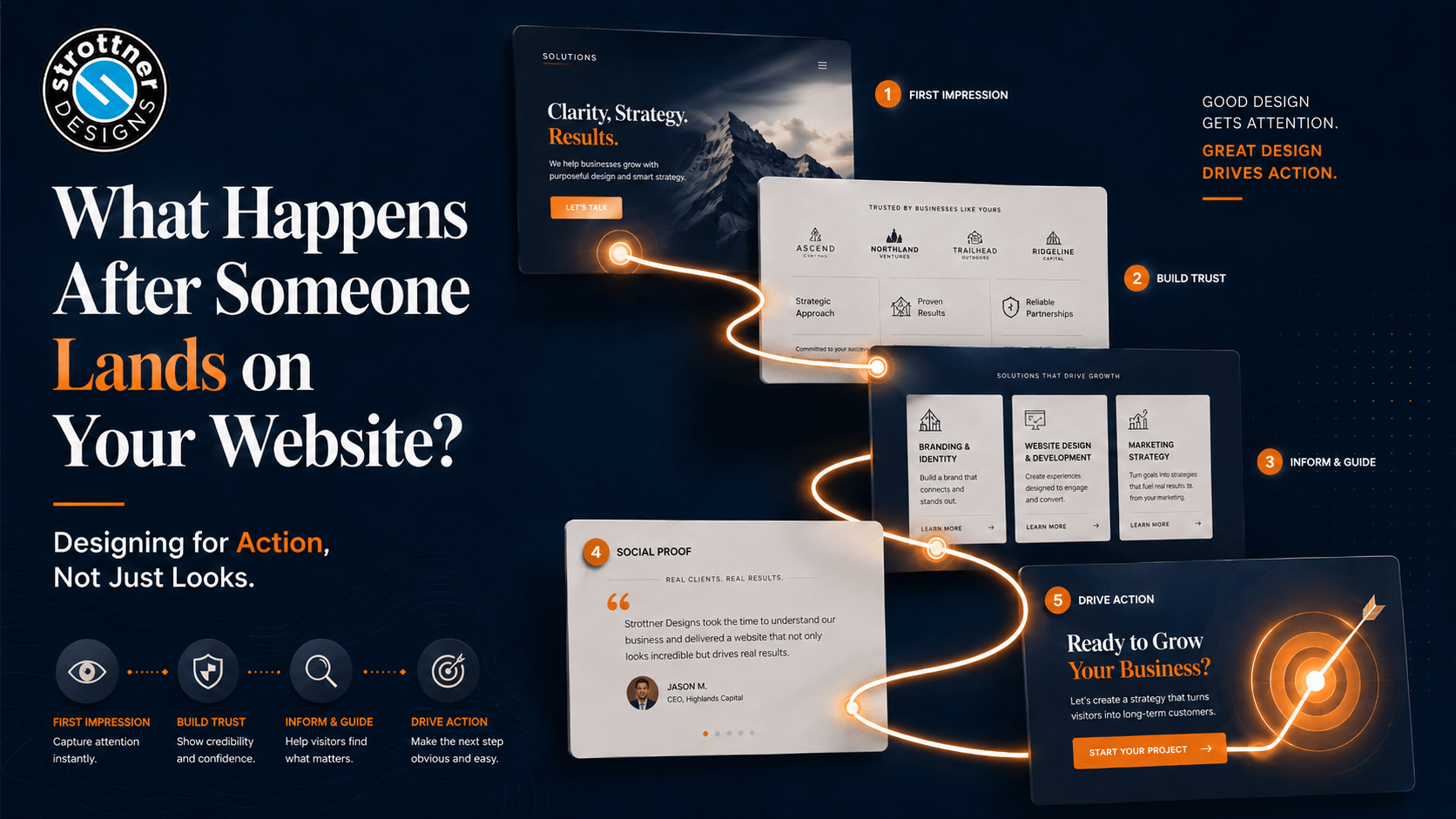
The strongest websites make a visitor feel two things quickly:
“I’m in the right place.”
“I know where to go next.”
That sounds simple. It IS simple. It’s also where a lot of websites fail.
Sometimes the site is visually strong but the messaging is too foggy. Sometimes the service pages say what the business offers, but not why it matters to you. Often the homepage asks for a consultation before it has explained enough to make that feel reasonable.
A site designed for action removes that kind of friction.
It helps visitors find what they came for without making them work for it. It doesn’t force them to decode the business, hunt for basic answers, or guess what the next click should be.
That is not less design.
That’s better design.
This is one of the clearest differences between a site that merely looks good and one that performs well.
A good-looking website presents information.
A stronger website anticipates hesitation.
If someone is on a service page, they are probably wondering things like:
What’s included?
Is this right for a business like mine?
What makes this company different?
Is there proof this works?
What happens if I contact them?
A page built for action doesn’t leave those questions floating around unanswered. It gets ahead of them.
That is where hierarchy, layout, proof, and page flow start doing real work. The site isn’t just displaying content. It’s guiding decisions.
This is another common problem.
A visitor lands on the page and immediately gets hit with “Book Now,” “Schedule a Call,” or a popup asking for contact details before the site has done much of anything to earn that step. For the record, we don’t like this when it happens to us, either!
That’s not conversion strategy. That is rushing the conversation.
People usually need a little confidence first. They need clarity. They need context. And they want to feel like they’re dealing with a business that looks credible and understands what they need.
That’s why at Strottner, we think websites should do both jobs well: look strong enough to build confidence and function clearly enough to move people forward.
Because one without the other is incomplete.
Usually, it’s not dramatic.
In other words, the website should feel good and work well.
That is the standard, we know, crazy, right?
At Strottner Designs, we don’t believe businesses should have to choose between a beautiful website and an effective one.
We build websites that look strong, feel modern, and reflect the brand well. But we also build them to help people find what they want as easily as possible. That means clear structure, better flow, strong messaging, and a user experience that makes the next step feel natural.
Because a website should not just win the first impression.
It should know what to do with it.
When someone lands on your website, the design starts making promises right away.
It promises that your business is current, or it suggests that it is behind.
It promises clarity, or confusion.
It promises momentum, or drift.
That is why designing for action matters.
Not because looks do not matter.
Because looks do matter, and after that, the site still has to help people move.
A beautiful website should not just impress someone for five seconds.
It should make the next five minutes easier too.
Is your website making a strong impression and helping people take the next step?
At Strottner Designs, we build websites that do both. Our approach combines strong visual design with clear structure, better messaging, and user flow that helps visitors find what they need and move toward action with less friction.
![]()
Interested in a new site and SEO, or just a new site? Visit Home of the Free Website to learn how we can build you a free or affordable site.
Privacy Policy | Sitemap | Terms of Use