 There was a time when simply having a website felt like a win.
You had your logo in the top left, a few stock photos of people smiling at laptops, a paragraph about your company’s commitment to excellence, and a contact form hidden somewhere under three layers of navigation like a family recipe. That was enough to say, “We’re online.”
Now? Not even close.
Today, a website can’t just exist. It has to earn its keep.
If your website is acting like a digital brochure, it may look polished and say a few respectable things, but it probably isn’t doing enough to generate leads. And that’s the real issue. A website shouldn’t just sit there looking nice, like office art that happens to have a domain name. It should help your business grow.
That means it should attract the right people, build trust quickly, answer the questions that matter, and make the next step feel obvious. In other words, it should work like a sales asset, not a placeholder.
That matters even more now because people don’t arrive at websites the way they used to. They’re searching with more detail, comparing faster, and often showing up with a better sense of what they want. They’re not just browsing. They’re evaluating.
So if your website still behaves like a laminated handout from the front desk, it’s time for an upgrade.
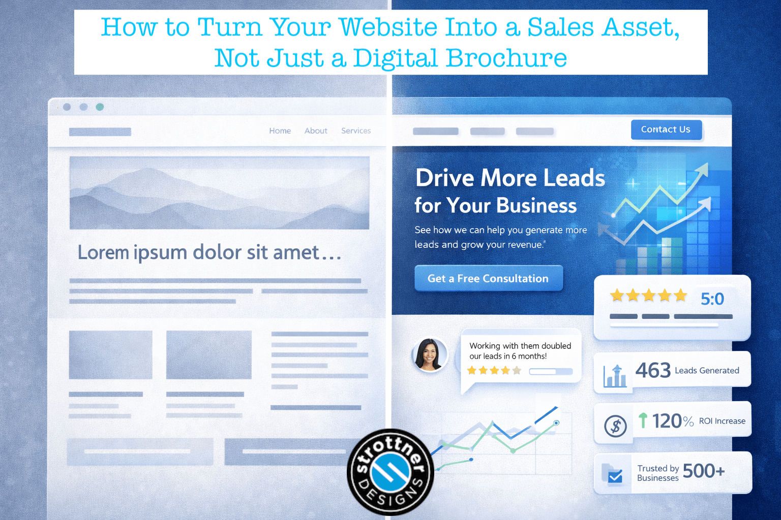
A brochure website informs, but it doesn’t persuade.
It usually tells visitors who you are, what you do, and maybe where you’re located. It may include a few service descriptions, an About page, and some broad language about quality, integrity, and customer service. Nothing wrong with any of that. The problem is that it often stops there.
It doesn’t move the visitor any closer to a decision.
It doesn’t answer the questions people actually have before they reach out.
It doesn’t make your value easy to understand.
And it doesn’t create much momentum.
A brochure website says, “Here we are.”
A sales-focused website says, “Here’s how we help, here’s why that matters, and here’s what to do next.”
That’s the difference.
One proves you exist. The other helps generate leads.
A sales asset is a website that helps support revenue.
Not in a loud, pushy, late-night-infomercial kind of way. It doesn’t need to pop up every six seconds yelling “ACT NOW” like it’s trying to move patio furniture before the season ends. It just needs to do its job well.
A strong sales website usually does five things:
That’s what separates a website that looks professional from one that actually performs.
Most websites don’t struggle because they’re ugly.
Some are, to be fair. But ugly isn’t always the real problem.
Usually, the bigger issue is that they’re vague.
The copy is broad. The services are described in generic language. The homepage is heavy on branding and light on clarity. The calls to action are weak. The navigation assumes visitors will happily click around until they piece the whole story together themselves.
They won’t.
People are busy. They’re distracted. They’ve got six tabs open, two texts waiting, and a coffee going cold somewhere nearby. If your website makes them work too hard to understand what you do and why they should care, they’re gone.
Not because your business isn’t good.
Because your website didn’t make the case.
That’s one of the biggest reasons websites fail to generate leads. They ask the visitor to do too much of the interpretive work.
The homepage is where brochure thinking usually shows up first.
A lot of businesses treat it like a lobby. Big image. Clever slogan. Maybe a slider if someone really wanted to make things exciting in 2014.
But your homepage shouldn’t just look polished. It should answer a few questions fast:
That doesn’t mean your homepage has to say everything. It just means it should orient people quickly and point them in the right direction.
A homepage isn’t supposed to be mysterious. It’s not a movie trailer. You don’t need suspense. You need clarity.
If someone lands on your site and still can’t tell within a few seconds what kind of business you are, the homepage is doing décor, not sales.
One of the easiest ways to turn a website into a brochure is to make it all about you.
We’ve been in business for 20 years.
We’re passionate about what we do.
We believe in quality.
We care deeply about our clients.
We’re committed to excellence.
That’s all fine. It’s also what nearly every business says.
Meanwhile, the visitor is sitting there wondering one thing: “Okay, but what does this mean for me?”
Your site has to translate your experience into relevance.
Don’t just say you offer web design. Explain what kind of businesses you help and what a better website can actually do for them. Don’t just say you provide SEO. Explain how that helps qualified prospects find the business and turn visibility into leads. Don’t just say you’re full-service. Explain why that’s useful to a client who doesn’t want to juggle five different vendors and a spreadsheet that looks like a hostage note.
Your experience matters. Your longevity matters. Your awards matter.
But only if the visitor can connect those things to a result they care about.
This is where a lot of websites quietly lose business.
Too many service pages are basically menu items with paragraphs underneath them.
SEO.
Web Design.
PPC.
Social Media.
Branding.
Click through, read a few lines, nod politely, learn almost nothing, leave.
That’s not a sales page. That’s a label with some padding around it.
If you want to make your website generate leads, your service pages have to do more than define the service. They need to help the buyer picture what working with you actually looks like and why that work matters.
A good service page should answer questions like:
That’s where a page starts doing real sales work.
Think of it this way: a brochure says “We offer SEO.” A sales-focused website says, “Here’s how SEO helps the right people find you, here’s how we approach it, and here’s how to know whether it’s the right move for your business.”
One is a label. The other is guidance.
Any company can make claims.
Everybody says they’re trusted. Everybody says they get results. Everybody says they care. If those words alone closed deals, half the internet would be unstoppable.
What actually moves people is proof.
Proof is what takes your website from “sounds nice” to “this might be the right team.”
That proof might include:
Proof lowers risk. It gives the visitor something solid to hold onto. And that matters because most people aren’t asking, “Could this company maybe do the work?”
They’re asking, “Can I trust them enough to start the conversation?”
Your website should answer that before they have to guess.
One of the smartest things a website can do is answer the questions people are already thinking but haven’t said out loud yet.
Questions like:
If your website doesn’t answer these kinds of questions, visitors often leave to “do more research,” which is usually a polite way of saying they wandered off to compare you with three competitors and a Reddit thread.
This is where strong content, FAQs, service-page sections, process pages, and comparison articles become incredibly useful. They don’t just make the site more informative. They make it more persuasive, because they reduce uncertainty.
Clarity builds confidence.
And confidence moves people forward.
A lot of websites don’t have a CTA problem. They have a bad CTA problem.
“Learn more” is often too vague. “Submit” feels like paperwork. “Contact us today!!!” has the energy of someone sprinting after you in a parking lot.
A strong call to action should tell the visitor exactly what happens next and why it’s worth doing.
For example:
Those are better because they’re specific. They reduce friction. They feel like the start of something useful, not a leap into the unknown.
And that’s important. Most people don’t avoid taking action because they hate action. They avoid it because they’re not sure what they’re signing up for.
A good CTA clears that up.
This is where a lot of businesses split themselves in half.
They either create pages to rank, with keyword-heavy copy that sounds like it was written by a machine trying to impress another machine, or they create pages that sound polished but have almost no chance of being found.
A strong website needs both.
It needs pages that align with what people are actually searching for, and it needs those pages to do something useful once visitors arrive. That means your content can’t stop at getting the click. It has to earn the next step too.
If you want to know how to make your website generate leads, this is a big part of the answer. SEO brings the right people in. Conversion-focused copy helps them take action once they arrive. You need both. Otherwise, you’re either building a beautiful store with no foot traffic or driving traffic to a store where nobody can find the register.
Neither one is great for business.
A brochure website often leaves visitors to wander.
A sales-focused website gives them a path.
That’s where internal linking does real work. If someone lands on a blog post about how long SEO takes, they should have a natural path to your SEO services page. If they’re reading about website redesign, they should be able to move easily into related pages about branding, content, conversion strategy, or contacting your team.
Good internal links help search engines understand how your site fits together.
More importantly, they help people move through the site without hitting dead ends.
Every important page should do two things: answer the question that brought the visitor there, and point to the next question they’re likely to have.
That’s not just better UX. It’s better selling.
Design absolutely matters.
But not because people want flashy effects and dramatic transitions that make the site feel like it’s auditioning for an award show.
Design matters because it affects trust.
A cluttered site feels harder to trust. A dated site can make the business feel dated too. A confusing layout creates friction. Poor mobile experience makes people bounce. Weak hierarchy makes strong information harder to find.
Good design supports the message. It makes things easier to understand, easier to navigate, and easier to act on.
That usually means:
The goal isn’t to impress people with design tricks. It’s to help them feel confident using the site.
Nobody hires a company because the homepage had three sliders and a video background that took ten seconds to load. They hire the company because the site made the business feel credible, clear, and worth talking to.
One of the best things a strong website does is warm up the lead before anyone on your team ever gets involved.
By the time someone reaches out, they should already understand a lot:
That’s where content becomes incredibly valuable. Blog posts, case studies, FAQs, service pages, and comparison content don’t just help with traffic. They shape the buying conversation before it starts.
They answer questions early.
They build trust at scale.
They help people feel informed instead of uncertain.
And they often make your sales conversations shorter and better because the prospect isn’t showing up cold. They’re showing up with context.
That’s a big difference.
It’s also one of the clearest answers to how to make your website generate leads more consistently. Helpful content builds momentum before the first call ever happens.
The good news is that most brochure-style websites don’t need to be thrown into the sea. They usually need better messaging, stronger structure, and a more intentional conversion path.
Start here:
If the answer is no, the page may still be informative. But it isn’t doing much sales work yet.
A simpler way to think about it
A digital brochure says, “Here’s our business.”
A sales asset says, “Here’s how we help, here’s why that matters, and here’s what to do next.”
That’s the shift.
Your website shouldn’t just confirm that your business exists. It should support growth. It should help the right people find you, understand you, trust you, and take action.
It should work for search.
It should work for real humans.
And ideally, it should do all of that without sounding like a robot in a blazer.
Because the businesses that win online usually aren’t the ones with the loudest claims or the fanciest animations. They’re the ones whose websites actually do the job.
And the job isn’t just to sit there looking respectable.
It’s to generate leads.
Is your website helping your business grow, or just sitting there looking nice?
At Strottner Designs, we build websites and content strategies that do more than check a box. We help businesses create websites that attract the right traffic, build trust, and turn visitors into leads. Contact us today to learn more!
![]()
Interested in a new site and SEO, or just a new site? Visit Home of the Free Website to learn how we can build you a free or affordable site.
Privacy Policy | Sitemap | Terms of Use