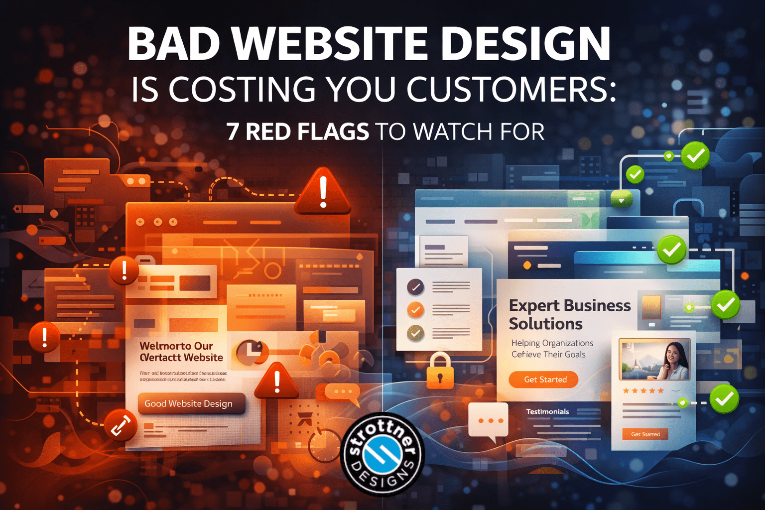
Bad website design doesn’t always show up wearing clown shoes.
Sometimes it’s obvious. Tiny text. Clashing colors. A homepage slider still fighting for relevance like it’s 2014. A stock photo of a man in a headset smiling like he just solved global peace through customer service.
But more often, bad website design is quieter than that.
It hides behind “good enough.”
It looks decent at a glance.
It technically works.
It even gets the occasional polite compliment.
And still, it quietly costs businesses customers.
That’s because people don’t experience a website as a technical checklist. They experience it as a feeling. Fast. They decide whether a business seems credible, clear, easy to work with, and worth contacting in a matter of moments. Nielsen Norman Group has long identified design quality, up-front disclosure, current content, and visible connection to the broader web as key credibility factors in whether a site feels trustworthy.
That matters for conversions, and it matters for search too. Google continues to emphasize helpful, reliable, people-first content, and its guidance for AI features says site owners should keep focusing on unique, useful content and a good page experience rather than trying to “optimize for AI” as a separate discipline. Google also says page experience can contribute to success when many pages are similarly relevant.
In other words, bad website design is not just a branding issue.
It’s a trust issue.
A usability issue.
A conversion issue.
And often, an SEO issue too.
At Strottner Designs, this is one of the most common performance problems we see. Businesses invest in traffic, content, and marketing, then lose momentum on the site itself because the design experience creates just enough confusion or doubt to slow people down.
So let’s talk about the red flags.
Not the cartoonish ones.
The real ones that quietly make people hesitate, bounce, and choose someone else.
A website doesn’t have to be ugly to underperform.
That’s part of what makes this tricky.
A site can look clean enough and still create just enough friction, doubt, or confusion to damage results. Maybe the messaging is vague. Maybe the navigation is clunky. Maybe the design feels dated. Maybe the calls to action are too aggressive too early. Maybe the site explains what the business does but never makes the visitor feel confident enough to act.
That kind of design failure rarely shows up as one dramatic collapse. It shows up as drift.
Lower conversion rates.
More bouncing.
Fewer form fills.
Shorter visits.
Prospects who reach out less often than they should.
Baymard’s usability research consistently points to a simple truth: usability issues create hesitation and abandonment, even when the underlying product or offer may be strong.
That means a business can have the right services, the right audience, and even the right traffic, then still lose customers because the site experience makes the business feel harder to trust than it should.
That’s expensive.
And it happens all the time.
This is one of the most common forms of bad website design.
The site looks modern enough. The colors are fine. The fonts are clean. The photography is decent. But after five or ten seconds, the visitor still can’t confidently answer a basic question:
That’s a problem.
A lot of businesses mistake polish for clarity. They build a homepage that looks sharp but leads with abstract language like:
“Innovative solutions for visionary growth.”
“Strategic excellence for modern brands.”
“Transforming possibility into performance.”
That all sounds expensive. It also sounds like it was assembled in a boardroom where nobody was allowed to use nouns.
Visitors trust what they can understand. Google’s helpful-content guidance points in the same direction: create content for people first, and aim to leave visitors feeling they had a satisfying experience.
If the website is making users decode what the business does, that’s bad website design, even if the layout is pretty.
Because confusion is friction.
And friction is where conversions go to die.
People notice when a website feels stale.
They may not say it out loud. They may not even consciously identify what feels off. But outdated visuals, old team pages, broken layout sections, ancient blog archives, stale copyright dates, and patchy design consistency all send the same message:
“This may not be a business that has its act together.”
This is one reason bad website design is sometimes less about one terrible decision and more about accumulated neglect. The site was fine three years ago. Then some pages were updated, others weren’t. New branding got added in parts. Mobile details were ignored. The blog stopped. The photos aged. A few links broke. The whole thing started to feel like a nice house with peeling trim and one wobbly stair nobody mentions.
That affects trust.
And trust affects whether people stay.
Visitors should not have to perform a treasure hunt just to find your services, your contact information, or a clear next step.
If navigation feels cluttered, overcomplicated, vague, or oddly organized, people start losing confidence fast. Not just because it’s annoying, but because it makes the business feel disorganized.
A clean navigation system does something simple and powerful: it reduces effort.
That matters more than many businesses think. If users can’t predict where to click next, they start questioning the site. If they question the site, they start questioning the company.
Common navigation red flags include:
Navigation is not just a design detail.
It’s one of the fastest ways a site signals either competence or chaos.
This one shows up in a few different ways.
A pop-up appears before the visitor has even read the headline.
A form asks for too much information right away.
The site pushes “Contact Us Today!!!” before explaining anything useful.
The homepage goes straight to selling without building confidence first.
That’s a trust mismatch.
A good website understands that trust is layered. Google’s page experience guidance explicitly calls out intrusive interstitials as something to avoid because they can interfere with the user experience.
So when a website jumps to the ask too early, it can feel clingy, not helpful.
That does not mean strong calls to action are bad. It means they need the right timing, framing, and support. Visitors usually need at least a little confidence before they hand over their contact information, schedule a consultation, or start a conversation.
If your website behaves like it’s proposing on the first date, that’s a red flag.
A good website earns the ask.
A lot of service pages explain what a business offers.
Far fewer explain why the visitor should trust that offer.
That’s a huge difference.
A weak service page says:
“We offer SEO services.”
“We provide web design.”
“We create custom branding solutions.”
Fine. But the visitor is silently asking:
If the page never answers those questions, it may be informative, but it is not trust-building.
And if it is not trust-building, it is not doing its full job.
Google’s current guidance for AI features says users are asking more detailed questions and follow-ups, and site owners should keep focusing on useful, satisfying content that genuinely helps people.
That means service pages need more than category labels. They need clarity, process, proof, and buyer confidence.
This is one of the places where Strottner Designs often helps clients most. Many businesses do not need more pages first. They need the pages they already have to communicate more clearly, reduce doubt faster, and support conversions more effectively.
Because a service page should not just tell someone what you do.
It should help them feel better about doing it with you.
The internet is full of businesses claiming to be trusted, leading, strategic, innovative, passionate, results-driven, customer-focused, and committed to excellence.
If every website were as exceptional as it says it is, half the economy would be glowing.
What makes a site feel trustworthy is not how many flattering adjectives it uses.
It’s proof.
Proof can look like:
When a site relies mostly on self-description, it starts feeling thin. It may still look polished, but it asks the visitor to do too much believing without enough evidence.
That is not ideal on the internet, where skepticism is basically part of the furniture.
If a website keeps telling people it is amazing but never shows why, that’s a red flag.
Sometimes bad website design is not about aesthetics at all.
It’s about friction.
Pages load slowly.
Buttons feel small or awkward.
The mobile experience is cramped.
The text is hard to read.
The forms are annoying.
The layout shifts around.
Pop-ups interrupt the flow.
The experience just feels like more work than it should.
Google’s page experience documentation points site owners to things like HTTPS, avoiding intrusive interstitials, and strong page quality signals as part of the overall experience picture.
Baymard’s research reinforces the cost of usability problems. Friction increases hesitation, abandonment, and doubt.
That means a site can have smart messaging and still underperform if the experience feels annoying, unpredictable, or cumbersome.
Visitors rarely say, “I left because the interaction cost-to-confidence ratio was unfavorable.”
They just leave.
Which, from a business standpoint, amounts to the same thing.
This is the part where the blog stops nodding wisely and starts being useful.
Ask these questions about your site:
Then ask a harder question:
That question is uncomfortable. It is also useful.
Because the quiet cost of bad website design is usually hesitation.
And hesitation is expensive.
This is where the topic becomes bigger than design alone.
A lot of businesses still separate web design from SEO as if one is visual and the other is technical and they pass each other in the hallway without speaking.
In practice, bad website design makes SEO harder in very practical ways.
If a page is unclear, people bounce faster.
If service pages are thin, they satisfy less intent.
If navigation is weak, important pages stay buried.
If proof is missing, trust falls.
If page experience is rough, users engage less.
Google’s guidance keeps repeating a very simple principle: create helpful, reliable, people-first content and experiences. For AI features, Google says the same fundamentals apply.
That means design, messaging, structure, trust, and usability are all part of the same performance story.
A good-looking site that confuses people is not doing SEO any favors.
A technically optimized page that feels sketchy is not helping conversions.
A helpful article with no good path forward is wasting opportunity.
Search visibility and user trust are more connected than many businesses realize.
This is exactly the kind of work Strottner Designs helps clients solve.
Not by chasing superficial redesign trends or making everything louder and shinier, but by improving the things that actually affect confidence and conversion. Clearer messaging. Better service pages. Smarter navigation. More useful structure. Stronger proof. Better page flow. A site experience that feels easier to trust and easier to use.
Because most businesses do not need a website that merely looks updated.
They need one that feels more credible.
That is a different goal, and it is a much more valuable one.
Bad website design is not always dramatic.
Sometimes it is just one too many moments of hesitation.
One unclear headline.
One weak service page.
One clunky mobile experience.
One missing trust signal.
One too-early ask.
One more reason to wait, doubt, or leave.
That adds up.
And when it adds up across enough visitors, it starts costing real customers.
A strong website does not just look professional. It reduces doubt. It answers questions. It guides people clearly. It supports trust before it asks for action.
That is what better design does.
And in a search environment where both people and platforms increasingly reward clarity, usefulness, and credibility, that kind of design is not a luxury.
It is part of how growth happens.
Is your website helping people trust your business, or quietly giving them reasons to hesitate?
At Strottner Designs, we help businesses create websites that do more than look polished. We improve clarity, trust, usability, and conversion flow so your website feels more credible and performs more effectively.
Whether your site needs stronger messaging, better service pages, a smarter layout, or a more conversion-focused user experience, our team can help you fix the issues that may be costing you customers.
![]()
Interested in a new site and SEO, or just a new site? Visit Home of the Free Website to learn how we can build you a free or affordable site.
Privacy Policy | Sitemap | Terms of Use