 In this article, we are going to take a closer look at the process we took in crafting a logo for an apparel company catering to the oilfield and gas industry, Wildcatter Outfitters. As we do with any new logo or brand that we design, we followed our 5-D Design Process. Our 5-D Design Process is organized into five “D” phases: Discovery, Development, Design, Decisions, and Delivery. We make it our mission to fully understand your business objectives before embarking on any creative concepts through our 5-D design process. With this approach, expectations are met and/or exceeded while designing logos (or websites and any other creative products), and valuable resources — time and money — are not wasted.
In this step, we met (in this case, over the phone) with the potential client to discuss what they were looking for, to make sure we were the right fit for them, and to learn a little more about them and their business. This included learning about the business goals and the project’s scope. For Wildcatter Outfitters, they wanted a new apparel brand for the oilfield and gas industry that was instantly recognizable, like other major brands such as Adidas, Under Armor, or Nike. They wanted the same branding recognition as those major brands but catering to the oilfield industry so that people in that industry would be proud to wear their brand. These early discovery meetings are a critical first step, as they form the foundation of this new partnership. We were excited to work with them and they were excited to work with us. We quickly came to an agreement, signed a contract, and got to work!
They submitted their questionnaire, hand sketches from their group, some oilfield pictures from the field, and a list of brands they liked. We performed background research (lots of Googling), looked up competitors (which there are very few), gleaned information from their questionnaire to learn anything else we could about their business, industry, and competition. In a way, this part of the logo design process is similar to how an actor gets into character, as we immerse ourselves within their industry.
This step was a lot of fun as we were able to begin some preliminary sketches and get into the design phase! Based on the name, we started sketching different monograms (as many other major brands use their monogram such as Under Armor using a stacked U and A). With the name starting with Wildcatter, the W was a great starting point so we started sketching different “W” designs and tied in a wildcat drilling well to the middle of the “W”. We also tried some different ideas such as using pipes as a “WC” for WildCatter.
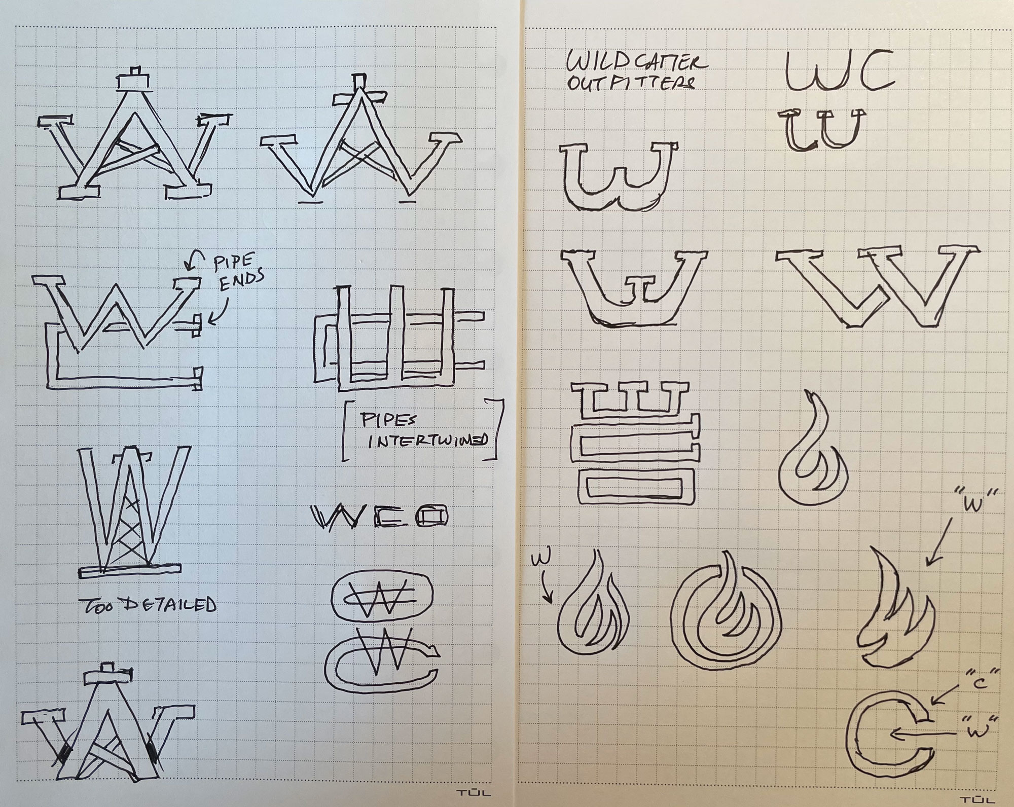
We chose a few of these drawings/concepts to make an initial concept sheet with the strongest candidates:
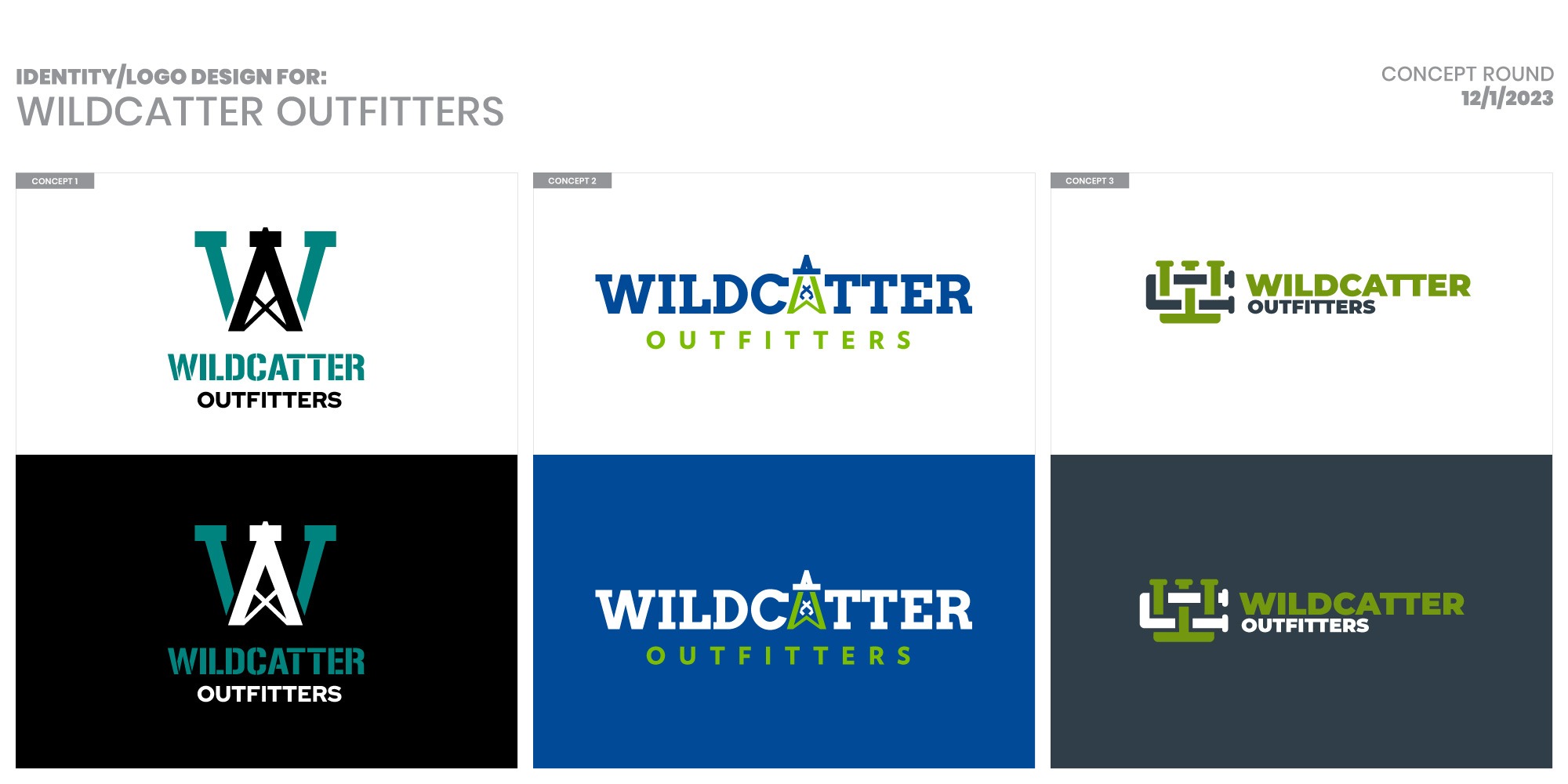
The client liked the initial group of logo options but thought the wildcatter well was a little too cliche and might be overused in the oilfield industry. Whenever an aspect of a logo is overused in an industry, it gets watered down and less recognizable to an emerging brand. It blends in with the competition. The client did like option three, but wanted a more “interesting” and “memorable” font used. They were also not keen on the color scheme. In fact, he wasn’t sure if he even wanted color at all for the logo as it would be going on different colored shirts, hats, jackets, etc, and the logo could be shown in a myriad of colors similar to the way other major brands are.
So, we went back to the drawing board to design a new set of 4 options (that included the chosen Concept 3 from the initial set as a new Option 3). We used the “WC” monogram to try different concepts including the new first option which formed an oil droplet in the negative space between the W and the C. The second new option was a gruffly “wildcat” that had an eye patch which was inspired from a rough sketch sent to us by the client in the discovery phase. The 4th new option was a custom monogram that made a W out of a flame (which is inspired from the flaring process in the oilfield industry) and a circle surrounding it but with a cutout to the right that forms the C.
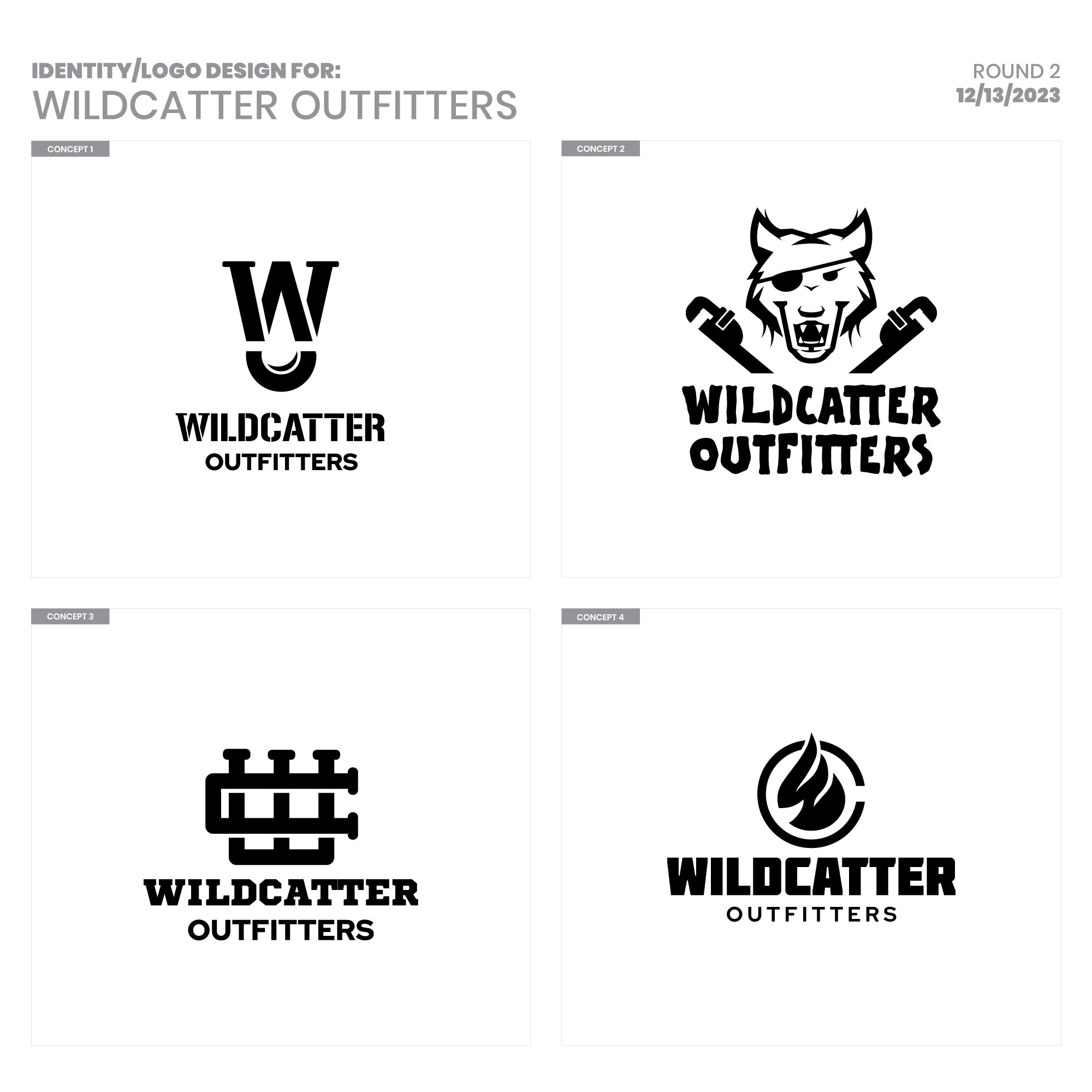
We presented the above set to the client and he ABSOLUTELY LOVED the 4th option! He liked this whole set but instantly gravitated to the 4th option, as did his whole crew. In his words, “We killed it with this design!” He liked the first one but the oil droplet catered a little too much to the oil industry and not as much to the gas industry. The second option was a little too detailed for a main brand (but may be used on future t-shirt designs in some capacity). The 3rd option was considered but he thought the 4th logo option was too perfect to not use!
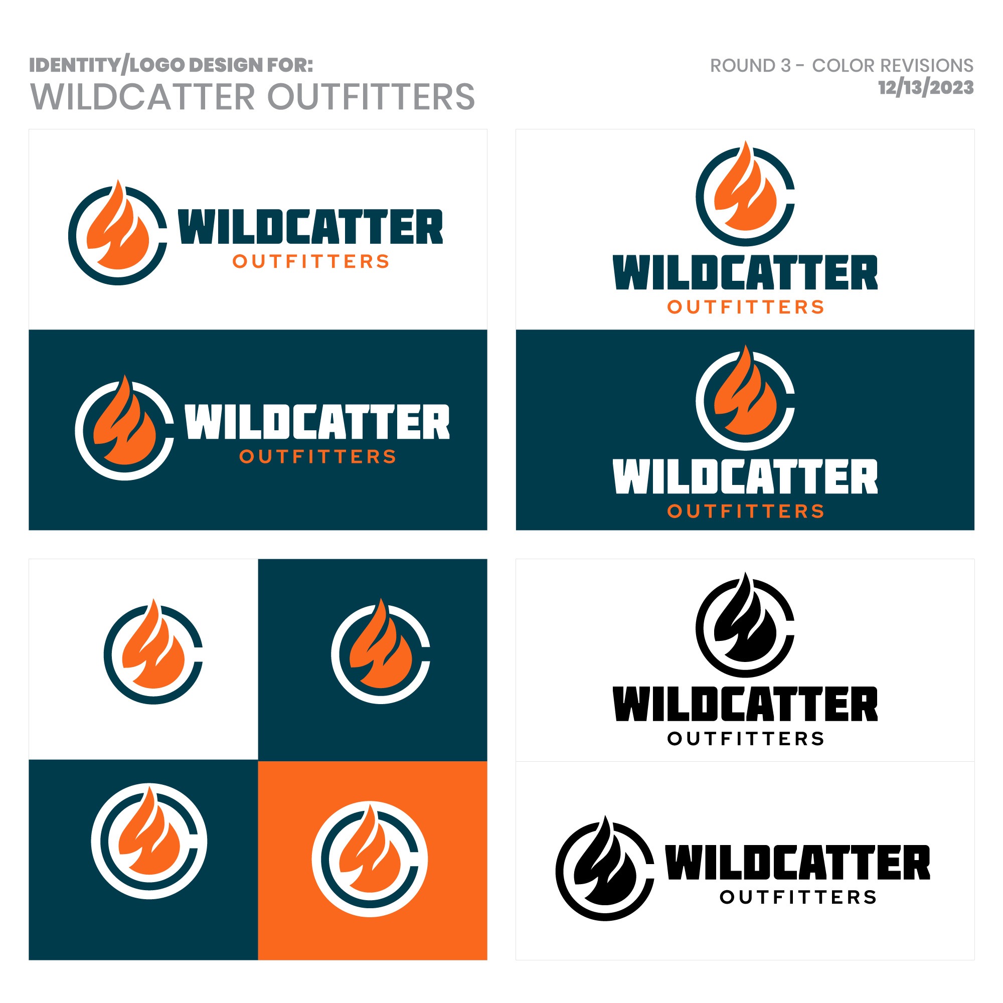
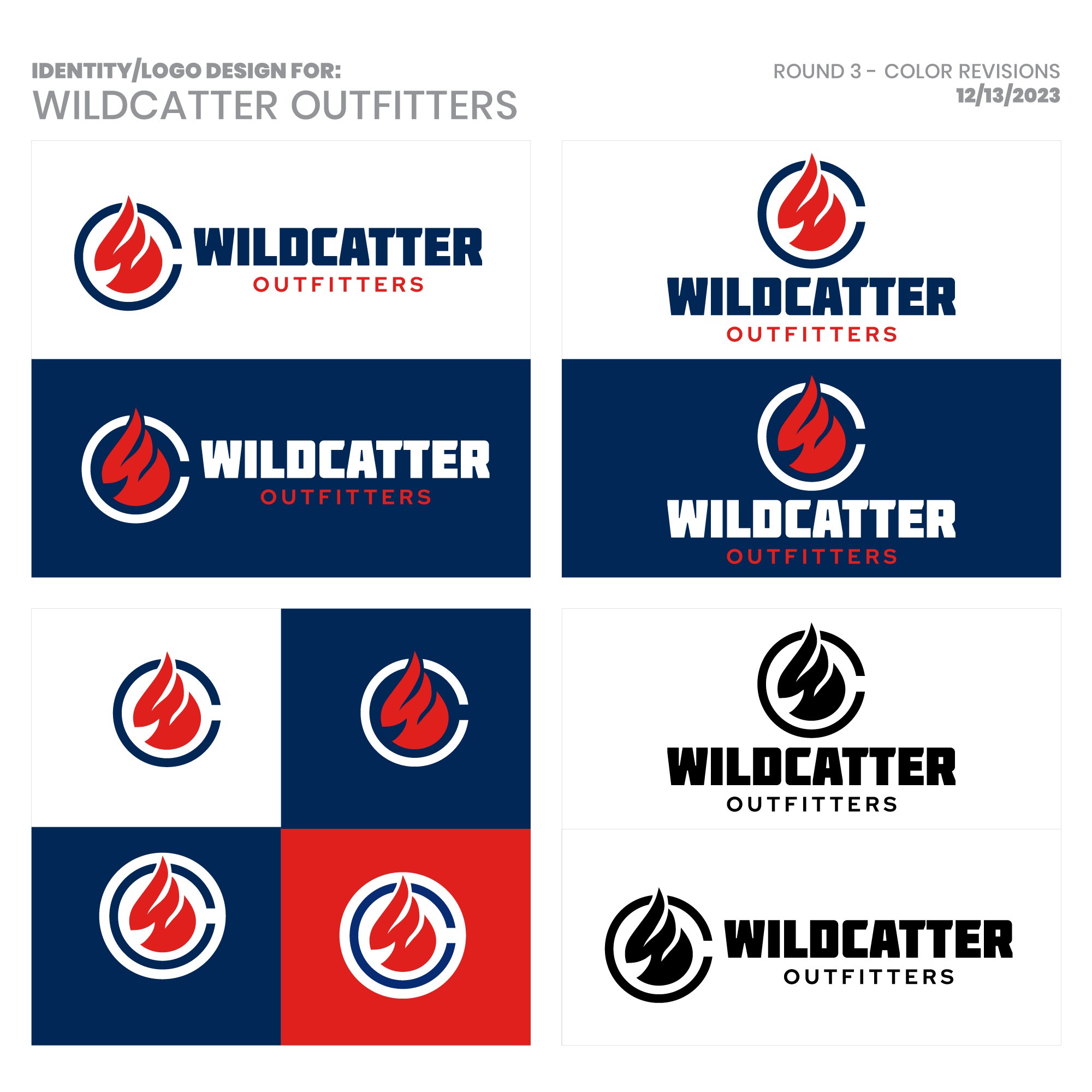
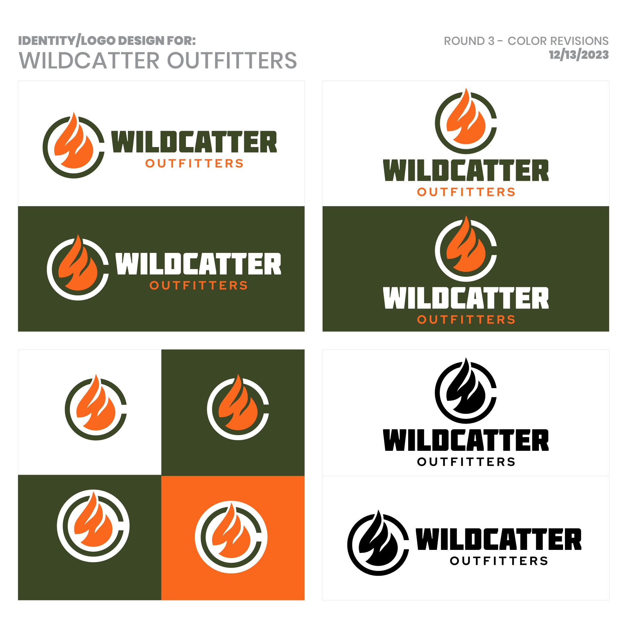
The next step was color! The client wasn’t sure he wanted to have the logo in color and was leaning towards keeping it in black and white but he was interested in seeing the logo in different color combinations so we made 4 sheets:
[col2]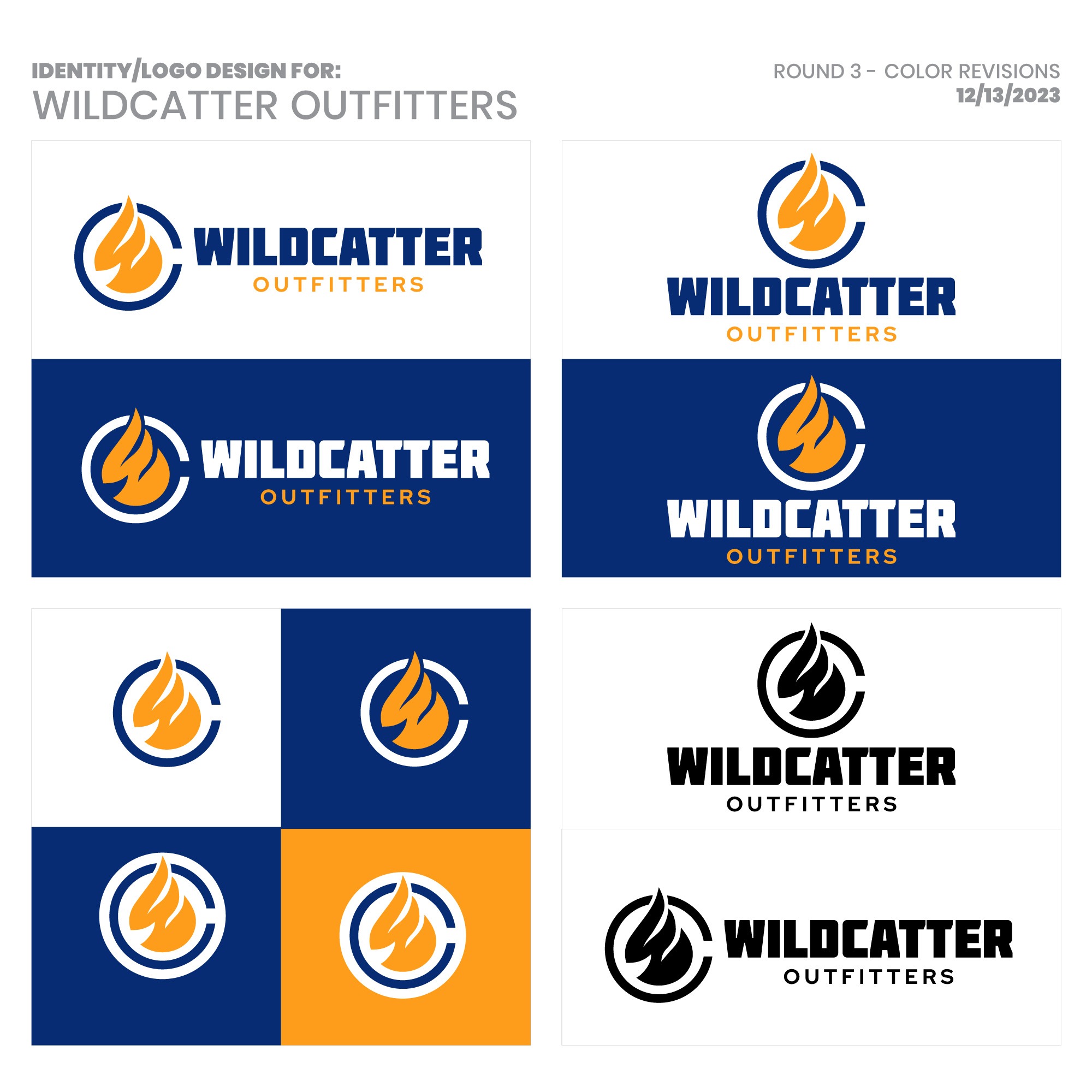 [/col2][col2]
 [/col2]
[col2]
 [/col2][col2]
 [/col2]
He really liked all of these color combinations and couldn’t pick just one, which cemented his desire to keep the logo in black and white and then use color in future apparel options (most likely using all of these at some point!).
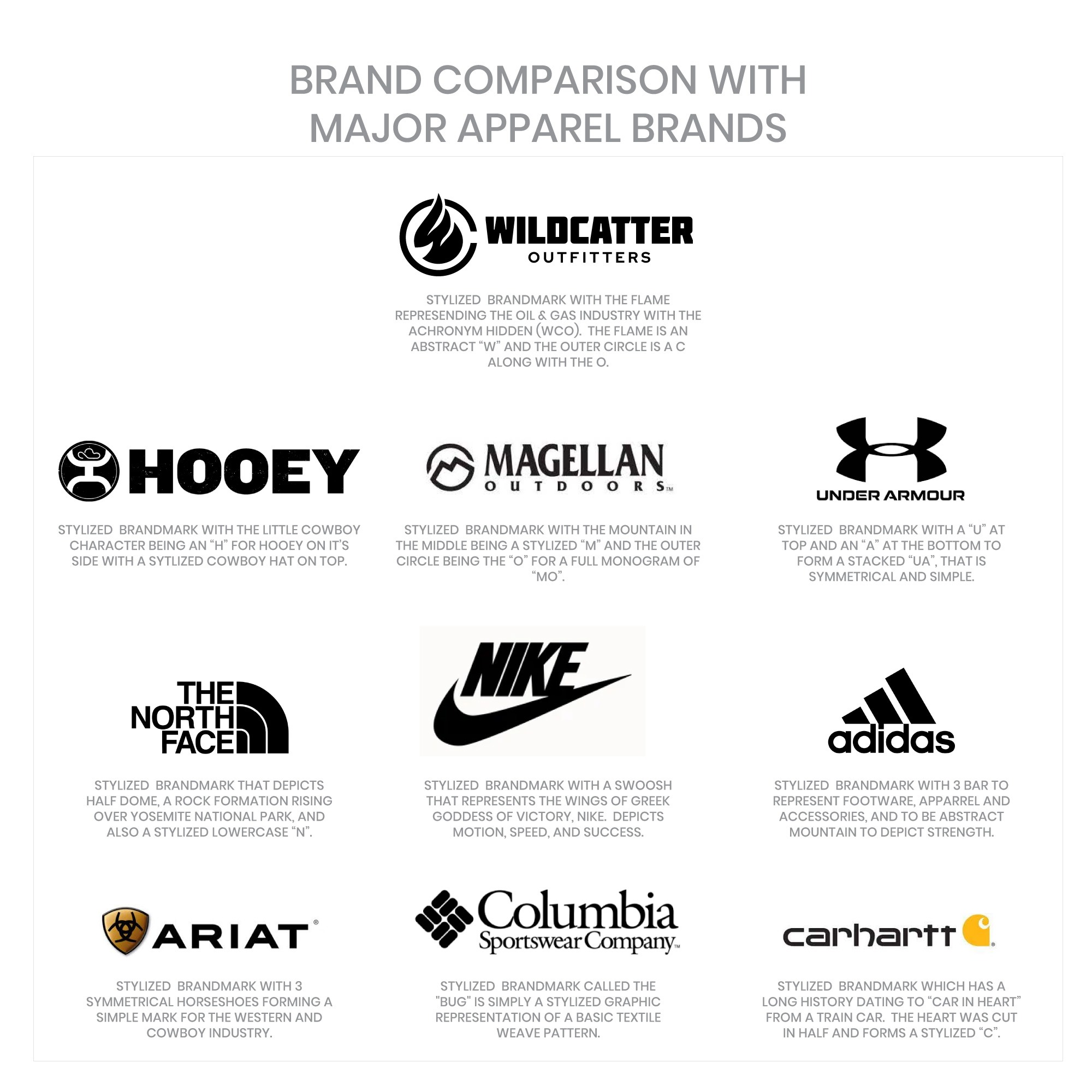
The initial design directive was to create a brand for the oilfield and gas industries that could be instantly recognizable like other major brands so as one of the last steps before delivering the logo files and the Style Guide to the client, we made a brand comparison sheet that placed his new logo among other major brands to see how they compare. This was a fun exercise as it showed the client how he compared to others and for us, it was fun to see the potential of how a brand that we custom-designed for our client might look and stand up compared to other major apparel companies.
In the end, the client was incredibly happy with the new logo design and brand that we designed for him. We delivered the logo files (all versions including the horizontal version, the vertical version, and the icon by itself) and the Style Guide. He immediately started the Trademark process with the USPTO.
If you would like to discuss a logo design project, please contact us today or call 210-588-9602 to schedule a free consultation.
Special Note: the other brands and logos mentioned in this article are for comparison uses only and are the trademarked property of their respective owner.
Privacy Policy | Sitemap | Terms of Use