Let’s start with a painful truth.
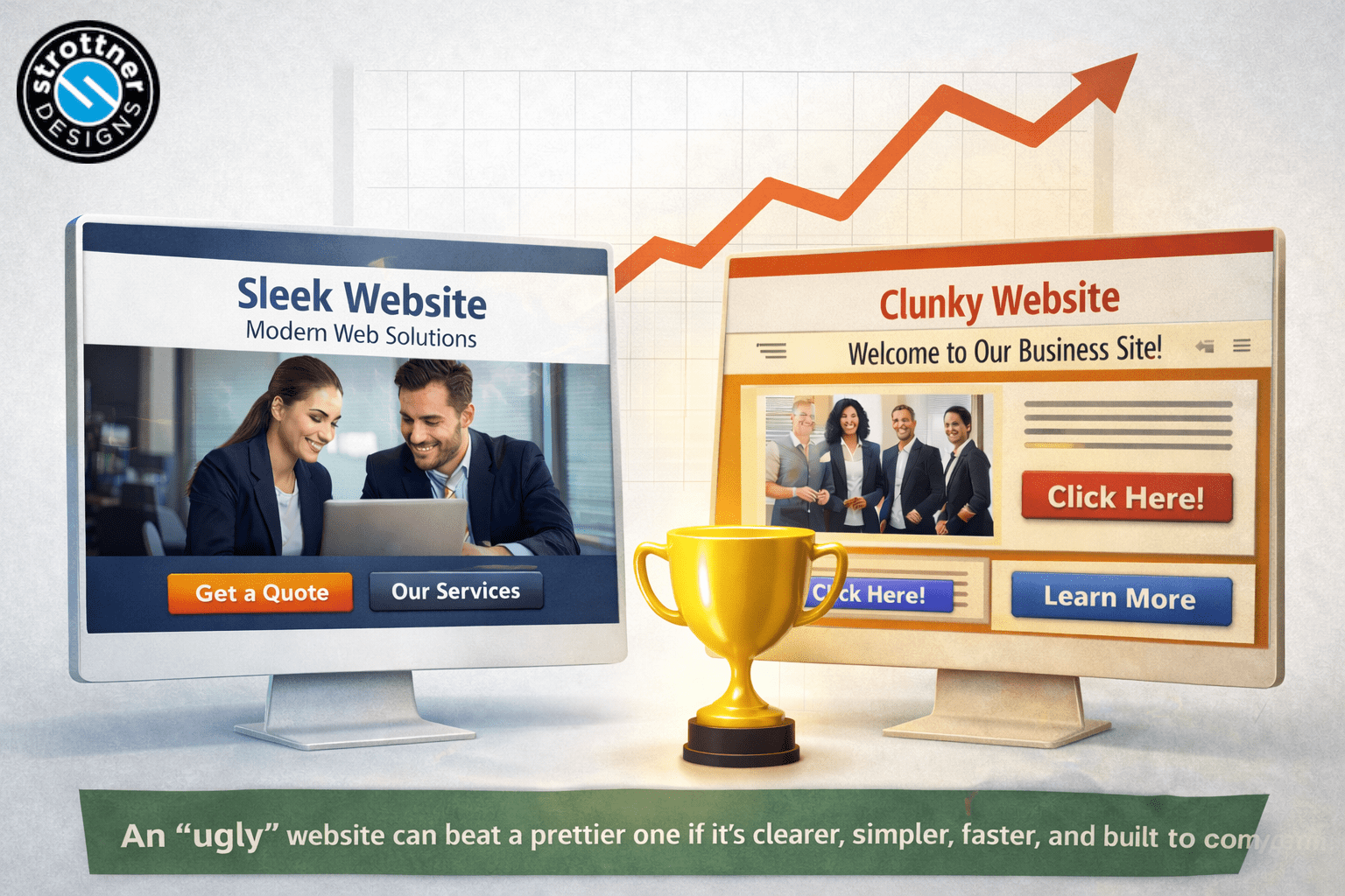
Sometimes your competitor’s website is objectively worse-looking than yours and still performs better.
You pull it up expecting to feel smug. Instead, you feel confused. Maybe even a little offended. The design is clunky. The photos are suspiciously generic. The layout looks like it hasn’t been touched since someone said, “Let’s circle back,” and meant it.
And yet they rank higher. They get more leads. Their phone rings. Their form fills up. Their sales team is busy while yours is wondering whether the last inquiry was a bot.
It doesn’t seem fair. But it is common.
At Strottner Designs, we see this all the time. Businesses assume that the better-looking website should automatically win. That would be neat, tidy, and very flattering to designers everywhere.
It’s also not how the internet works.
A website is not art hanging in a gallery. It is a tool. More specifically, it is a sales and marketing tool. And sometimes the website with less polish performs better because it does a better job of helping visitors understand, trust, and act.
So if your competitor’s website is outperforming yours, even though it looks worse, here’s what may actually be going on.
This is the part many companies miss.
Visual design matters. It absolutely matters. People do judge credibility based on appearance. A modern, professional website can create a stronger first impression and help support trust.
But design alone does not carry the whole load.
A website also needs to answer questions, guide people, reduce friction, and move visitors toward a next step. If it fails at those things, no amount of sleek design is going to save it.
That’s where uglier websites sometimes pull ahead. They may not be impressive, but they are useful. They may not win design awards, but they win business.
And in the end, that’s the scoreboard that matters.
This is one of the biggest reasons a competitor’s website outperforms yours.
Many businesses try so hard to sound polished that they stop making sense. Their headlines become vague. Their homepage copy becomes stuffed with buzzwords. Their services are described in language that sounds important but says very little.
You’ve probably seen something like this:
“Innovative solutions for scalable growth in today’s evolving marketplace.”
That sounds official. It also sounds like absolutely nothing.
Now compare it with this:
“We build custom manufacturing websites that generate more qualified leads.”
That one is plain. It is also clear.
Clear wins.
If a visitor lands on your competitor’s site and immediately understands what they do, who they help, and why it matters, that site has a major advantage, even if it looks less refined.
Most visitors are not studying your design details. They are scanning for answers. If your message is fuzzy and theirs is sharp, they are going to convert more traffic than you.
Some websites are designed to be admired. Others are designed to make the phone ring.
Those are not always the same thing.
A lot of companies invest in beautiful design and never think through the actual conversion path. They end up with a polished homepage, nice animations, and a navigation menu with seventeen options, but no clear user journey.
Meanwhile, their competitor has a less glamorous site with a strong call to action, simple forms, and service pages that push visitors toward action.
Guess who wins?
Usually the one who made things easier.
A high-converting website tends to do a few basic things well:
If your competitor’s website is focused on lead generation and yours is focused on looking impressive in a boardroom meeting, that performance gap is not a mystery. It’s a strategy issue.
People trust people.
That should not be groundbreaking. And yet many websites still sound like they were written by a committee trying to impress another committee.
The result is stiff, overcooked copy full of phrases like:
Nobody talks like that. More importantly, nobody believes it.
Your competitor may have a less polished site, but if their copy sounds direct, natural, and helpful, visitors are more likely to stick around. Human language builds trust faster than corporate language.
A sentence like this:
“Need a new site that actually brings in leads? We can help.”
is much more persuasive than:
“We deliver integrated digital experiences aligned with your growth objectives.”
One sounds like a real company. The other sounds like a mission statement trapped in an elevator.
At Strottner Designs, we believe a strong website should sound smart without sounding fake. That balance matters.
Visitors come to your site with questions. Good websites answer them quickly.
What do you do?
How does it work?
How much does it cost?
Why should I trust you?
What makes you different?
What happens next?
If your competitor’s website answers those questions and yours dances around them, they are going to win more business.
This happens constantly. Companies avoid specifics because they think details will scare people off. They skip pricing conversations. They hide process information. They bury service explanations under generic copy.
But buyers do not reward mystery. They reward clarity.
Even if your competitor’s site is visually weaker, it may be reducing uncertainty better than yours. And that is often what leads to more conversions.
People do not need every answer right away. But they do need enough confidence to take the next step.
This is not the glamorous answer, but it is a very real one.
Sometimes your competitor’s website is outperforming yours because it is faster.
That simpler design you were quietly judging may actually be helping them. Fewer oversized videos. Fewer heavy animations. Fewer fancy visual effects that slow everything down.
Users are impatient. If your site takes too long to load, they leave. It is that simple.
And when they leave, they do not stick around to admire your typography choices.
A fast website creates a better experience, supports search visibility, and gives visitors access to the information they want before they get annoyed and disappear. A slower “prettier” site can lose on all three fronts.
So yes, your competitor’s less exciting website may be beating yours partly because it respects the user’s time.
Rude, but effective.
A big reason one website outperforms another is that it matches what people are actually searching for.
This is where SEO becomes less about tricks and more about usefulness.
Your website may be full of polished language, but if it does not reflect the terms your prospects use, it becomes harder to find and less compelling when people land on it.
For example, let’s say a prospect is searching for:
industrial web design agency
or
B2B website redesign company
If your competitor has service pages built around those phrases and your site talks vaguely about “digital growth ecosystems,” they are more likely to rank, get the click, and convert the visit.
Good SEO content is not about stuffing keywords into every sentence. It is about creating pages that line up with real searches and real needs.
That means your site needs clear page structure, focused topics, useful content, and language that matches your market.
Your competitor’s website may not look better, but it may simply be doing a better job of showing up for the right searches.
Trust is easier to build when you can prove what you say.
This is where many websites underperform. They make claims, but they do not support them.
Your competitor may have a clunky design, but if they are showing testimonials, client logos, reviews, case studies, certifications, and measurable results, they are giving buyers what they need to feel confident.
That matters a lot.
Statements like these do real work:
Those details create credibility.
Meanwhile, many companies rely on generic self-praise:
That kind of language does not build trust because every company says some version of it.
Proof is more persuasive than claims. Every time.
A website should not make visitors guess what to do next.
And yet many websites do exactly that.
The call to action is hidden. Or vague. Or too soft. Or surrounded by so many competing options that the user gives up and leaves.
Your competitor may have an uglier website, but if the path forward is obvious, they are going to generate more leads.
Good calls to action are simple:
They are visible, repeated in the right places, and supported by landing pages or forms that are easy to complete.
Bad calls to action feel like work. Good ones feel like a small, logical next step.
And yes, this means your contact form should not ask for twelve pieces of information before someone can say hello. You are starting a conversation, not processing a mortgage.
This is a sneaky one.
Many underperforming websites are not actually designed for customers. They are designed for the leadership team, the marketing team, the sales team, and that one person who insists the company history belongs above the fold.
The result is usually a website trying to do too many things for too many people at once.
When that happens, buyers lose.
Your competitor may have a simpler, less polished website because fewer internal opinions got piled onto it. Their site may be more focused. More direct. More useful.
That matters.
The best business websites prioritize what the buyer needs to know first. They do not try to cram every internal talking point onto the homepage. They do not treat the navigation like a junk drawer. They do not make users work to find the good stuff.
A website should be structured around decision-making, not office politics.
A website is not a one-time project.
Or at least, it should not be.
One reason a competitor’s website may outperform yours is simple: they keep working on it.
They update pages. Improve messaging. Add new service content. Test calls to action. Refresh testimonials. Watch what converts. Remove what does not.
Meanwhile, a lot of businesses launch a site and then leave it alone for years. They treat it like a finished object instead of an active marketing asset.
That approach catches up with you.
Even small updates can improve performance over time. Better headlines. Better service pages. Better proof. Better page speed. Better offers.
Websites that perform well are rarely static. They evolve with the business and the market.
If your competitor is making steady improvements and you are still relying on copy written three leadership teams ago, they are probably going to stay ahead.
The good news is this problem is usually fixable.
The bad news is the fix is not always “make it prettier.”
Sometimes a redesign is the right move. But often the bigger issues are messaging, structure, user flow, and conversion strategy.
Start here:
Make sure a first-time visitor can tell what you do, who you help, and why it matters within seconds.
Cut vague, corporate language. Use words your customers actually use. Sound like a smart human being.
Make the next step obvious. Repeat it consistently. Remove friction from forms and contact pages.
Use testimonials, case studies, numbers, reviews, and client examples wherever they support a buying decision.
Create pages around real services, real industries, and real search intent. Help users find exactly what they need.
Page speed, structure, and usability matter as much as visuals. A good-looking site that frustrates users is still failing.
At Strottner Designs, we do not look at websites and ask only, “Does this look good?”
We ask:
Of course we care about design. We care a lot. But design should support the goal, not distract from it.
A strong website should look credible, feel modern, communicate clearly, and help drive business results. That’s the standard.
Because the real goal is not just to have a better-looking website than your competitor.
It is to have a better-performing one.
If your competitor’s website is outperforming yours, even though it looks worse, try not to take it personally.
Take website performance, conversion optimization, lead generation, website redesign, website messaging, SEO strategy, website audit it seriously.
It usually means they are doing something better beneath the surface. Their message may be clearer. Their pages may convert better. Their site may answer questions faster, build trust more effectively, or guide users more smoothly.
That is actually good news, because those things can be fixed.
And once you fix them, you do not have to choose between a website that performs and a website that looks great.
You can have both.
Which, frankly, is a much better outcome than losing leads to a website that looks like it was built during a group project nobody wanted to be part of. Contact us today and let us help!
![]()
Interested in a new site and SEO, or just a new site? Visit Home of the Free Website to learn how we can build you a free or affordable site.
Privacy Policy | Sitemap | Terms of Use