
Your website is your digital storefront and 24/7 salesperson – it greets prospects, guides them, and (ideally) seals the deal even when you’re asleep. But what if, instead of driving business, it’s quietly scaring leads away? A site can be polished and professional-looking yet underperform because of hidden flaws. As we at Strottner Designs know, looking professional doesn’t mean functioning well. In fact, marketing agencies point out that even a beautiful site with confusing design or missing cues will fail at its job.
The good news is, you don’t need Google Analytics to spot the red flags. Any business owner or marketer can do a quick visual inspection and feel when something’s off. In this post, we’ll walk through the intuitive signs that your site may be leaving money on the table, using real-world metaphors and practical tips. By the end, you’ll know exactly what to look for (and how Strottner Designs can help fix it).
Imagine walking down Main Street. A shop with a bright, inviting storefront and a friendly salesperson at the door will attract you in. Now imagine the opposite: a dusty window, confused signage, or no one to greet you. You’d likely walk on by. Your website works the same way. As we tell people all the time, your website is the storefront – it’s what customers see first, and a poor-quality, outdated design might deter potential clients. It also should be your hardest-working salesperson, tirelessly informing and selling 24/7.
If your site is outdated, confusing, or simply doesn’t engage, it’s like a store where the sign says “Open,” and the doors are locked – leads will just leave. So before diving into traffic numbers, ask yourself: Does my website make visitors feel welcome and guided? If not, keep reading for the warning signs.
Symptom: Your homepage headline or hero message is vague, jargon-heavy, or buried under visuals. Visitors seem puzzled about what you do.
Why it Matters: Research shows most people decide within 3–5 seconds whether to stay on a site or go back to Google. If your value proposition isn’t crystal clear, they’ll “bounce” before ever scrolling. A generic statement like “Innovative Solutions for Today’s Business” means almost nothing to a new visitor. As Patrick Strottner has said, “Beauty without messaging creates confusion.” Simply put, if users don’t immediately know what you offer and who it’s for, they click away. In short, clarity is critical.
What to check: Visit your homepage as if you’ve never been there. In the time it takes an elevator door to close, can you answer: “What exactly does this company do? Who is it for? Why is this the right place for me?” If not, that’s a lead killer. Update your headline and subheading to be specific. For example, instead of “Great Marketing Solutions,” say something like “We Help San Antonio Small Businesses Double Their Online Leads.” Use plain, benefit-driven language. This is your “elevator pitch” to a stranger (but with less time) – if it doesn’t land, the visitor leaves.
Symptom: You have no obvious buttons or links telling visitors what to do next. Or your CTAs are hidden or so generic nobody notices them.
Why it Matters: Imagine another store (we’re going to absolutely TORTURE the store metaphor in this post) where no sign points to the checkout or where the cashier is invisible. A business might have great products, but if customers don’t know how or where to buy them, revenue plummets. A website is identical: without a clear prompt, visitors wander off without converting. As one UX writer warns, “A beautiful site with no direction is a dead end. If users don’t know what to do next, they do nothing.”
What to check: Scroll through your key pages (homepage, services, etc.) without scrolling deeply. Can you see a single, prominent call-to-action (CTA) above the fold? For instance: “Book a Free Consultation,” “Get My Quote,” “Download a Guide,” or “Contact Us Now.” If the only CTA is a tiny link or buried in the footer, that’s a red flag. Even well-meaning sites often dilute their message with multiple equal CTAs or vague “Learn more” links. Ideally, each page should have one clear, compelling CTA.
One primary CTA per page, clearly visible and designed to stand out, is best practice. Think of it like your store’s exit door or checkout counter – make it impossible to miss. Without it, you essentially have a storefront with no “Open” sign.
“If users don’t know what to do next, they do nothing… One primary CTA per page, placed clearly and designed to stand out.”
Symptom: Your menu or page structure is confusing. Important information requires multiple clicks to find. Visitors frequently seem lost or overwhelmed by choices.
Why it Matters: In a brick-and-mortar store, poor navigation would be like having messy shelves and no aisle signs – customers give up and leave. On a website, confusing menus or hidden content do the same. Visitors assume: If I can’t find it easily, maybe this company isn’t well-organized. A confusing layout is a silent conversion killer.
What to check: Sit at your desktop, and pretend you’re a visitor with one specific goal (e.g. getting a quote or learning your hours). Can you get there in two clicks? If not, simplify. Review your menu labels: are they obvious and descriptive? If your site has many pages, group them logically or add a search box. Breadcrumbs (the “You are here” navigation trail) also help orientation.
“Unclear navigation … slow loading…user experience/workflow friction” all silently push visitors away. For easy leads, treat your website like a map: label everything clearly and avoid hiding key sections.
Symptom: Pages hang or load slowly, especially on mobile. Images and text appear in stages, or you see a spinning wheel for more than a couple seconds.
Why it Matters: In the age of instant information, speed is law. Even a one-second delay in page load can send impatient visitors to your competitors. Industry research confirms: every extra second of load time dramatically increases bounce rate. Google itself found that a 3-second page delay increases bounce rate by ~32%, and at 5 seconds it spikes even more. Another study notes “Most web users expect a website to load within 3–4 seconds; every fraction of a second more simply adds to their frustration.” In plain terms, if your site feels sluggish, visitors won’t stick around to explore it.
What to check: Test your homepage and key pages: do they appear almost instantly, or do you notice any lag? (You don’t need fancy tools for this; just try loading pages on a phone or desktop and watch.) If it feels noticeably slow, that’s a major red flag. Especially check that large images or scripts aren’t blocking the initial load.
Remember, speed isn’t just technical – it’s trust-building. Visitors equate a slow site with an unprofessional company.
“Most web users expect a website to load within three or four seconds… Every second of delay reduces conversions.” If your site isn’t hitting that benchmark, you’re likely costing yourself sales.
Symptom: On smartphones/tablets, text is tiny, buttons are hard to tap, or the layout breaks. Users have to pinch-zoom or swipe incessantly.
Why it Matters: More than half of all web traffic now comes from mobile devices. (Statcounter data shows ~54% of visits were from phones by late 2025.) If your site isn’t optimized for small screens, you’re ignoring the majority of potential leads. Poor mobile usability means lost business – visitors who tap in often bounce immediately if the site “feels cramped.”
What to check: Open your site on an actual smartphone (or shrink your browser window). Are menus still usable? Is the text readable without zooming? Are buttons big enough and spaced apart? If you find yourself hunting for links or mis-tapping, so will your customers.
Considering how many buyers browse on the go, ensuring a smooth mobile experience is essential – it’s no longer optional. Think of it as setting up a ramp and wide aisles in your storefront so any customer can walk in.
“Most users browse on mobile… if your site has tiny text or broken layouts, you’re losing conversions daily.”
Symptom: The visual style feels outdated (old fonts, dated color scheme), or it doesn’t match your current brand identity and messaging.
Why it Matters: First impressions matter. A shabby or mismatched design immediately erodes trust. Imagine an automotive shop still using 1990s clip art or a law firm’s site that looks like it was built a decade ago – would you feel confident buying from them? Audiences subconsciously judge brands by their look. Brand misalignment – like outdated visuals or logos and messaging that doesn’t match current offerings – creates confusion and erodes credibility.
What to check: Compare your site’s design to current trends (and competitor sites). Does it use low-resolution images or stock art from 10 years ago? Is the logo pixelated? Are the colors faded or clashing? If the answer is yes, it’s time for a refresh. A modern, cohesive look (from logo to layout) reassures visitors that you’re professional and up-to-date.
Think of it like updating a store’s window display each season. An outdated or mismatched storefront makes people wonder what else is behind – or worse, whether the store is still in business. A fresh, on-brand look communicates “we’re serious and reliable.”
Keeping visuals current is an easy way to signal professionalism – after all, your website is literally your public face online.
Symptom: Your site copy feels generic, overwritten, or hasn’t been updated in years. Blog posts are stale or missing, and content doesn’t address visitor questions.
Why it Matters: Your content is your 24/7 sales rep – it needs to educate, build trust, and inspire action. Even the best design can’t rescue bland or irrelevant text. Visitors are looking to understand how you solve their problem, not to be dazzled with buzzwords. A common mistake is treating a website like a brochure and forgetting it’s meant to persuade. Without engaging, helpful content, visitors bounce. Ask yourself: does your homepage copy answer the questions a prospect has in mind? Or does it just congratulate itself on being “innovative”? If your content is vague or obviously outdated, visitors will feel the mismatch.
What to check: Read through your key pages from the perspective of a lead. Is your unique selling proposition and service description current and specific? Are there clearly written benefits and next steps (with CTAs) on each page? Any sign of copy that sounds like it was written in the early 2010s (or earlier) means it needs an overhaul.
Remember the car analogy: style (design) is like a car’s appearance, while substance (content) is the engine. A flashy exterior still won’t get you far without the engine revving. In short, make every word count – speak plainly, be helpful, and guide the visitor with every sentence.
“Content needs to… educate, build trust, and inspire action” – it’s the engine that moves your website and your audience forward.
Symptom: Your site lacks testimonials, client logos, reviews, case studies, or even basic contact details. Visitors see no proof you can deliver.
Why it Matters: People are naturally wary of strangers online. If a website makes bold claims but shows no evidence, users won’t risk reaching out. Studies show that “people won’t hand over their information unless they feel like they can trust you”. That means things like customer testimonials, real project examples, logos of well-known clients, or industry awards can make the difference between a click and a dead lead. In other words, trust signals turn a site from a brochure into a credible brand.
What to check: Imagine you’re a visitor on the fence about calling. Are there quotes from satisfied customers? Before-and-after case studies? Do you clearly list your address, phone and email? Even small touches matter: a “Privacy Policy” link, a team photo, or a visible phone number in the header can build confidence.
Without these, your site is like a store with no reviews hanging on the wall – visitors feel nothing stops them from just walking out. “If your site doesn’t show proof—testimonials, [logos], or case studies—you’re missing a huge opportunity… Even something as small as… contact information… builds confidence.” Don’t let a lack of trust signals be the hidden reason visitors leave without becoming leads.
(Bonus check) Even without diving into analytics, you can see if your messaging is inconsistent by searching online. For example, if you Google your business name and see old descriptions or mismatched branding, that’s a red flag. (This is not about SEO metrics, just spotting obvious discrepancies.) All your channels – website, social media, listings – should tell the same story. Inconsistency can confuse or deter prospects.
The visitor wants to engage, but the path is more difficult than it should be or the signal is weak. If different parts of your web presence don’t reinforce the same value, visitors may feel they’re in the wrong place.
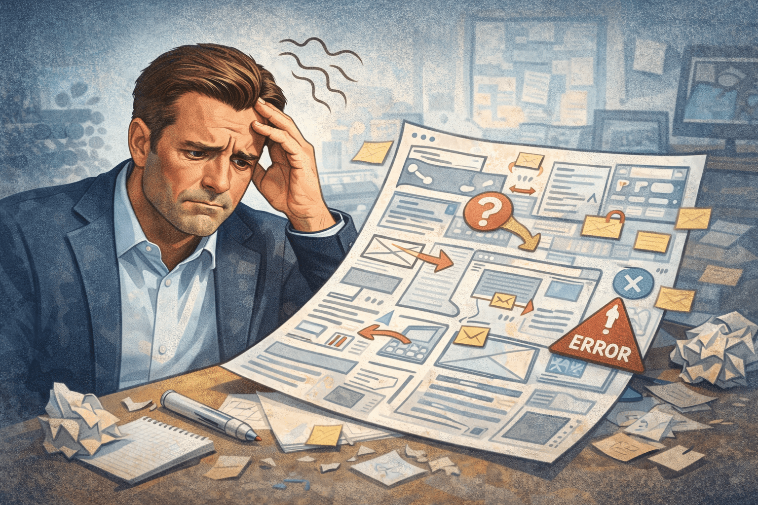
Don’t be this man, let us help you!
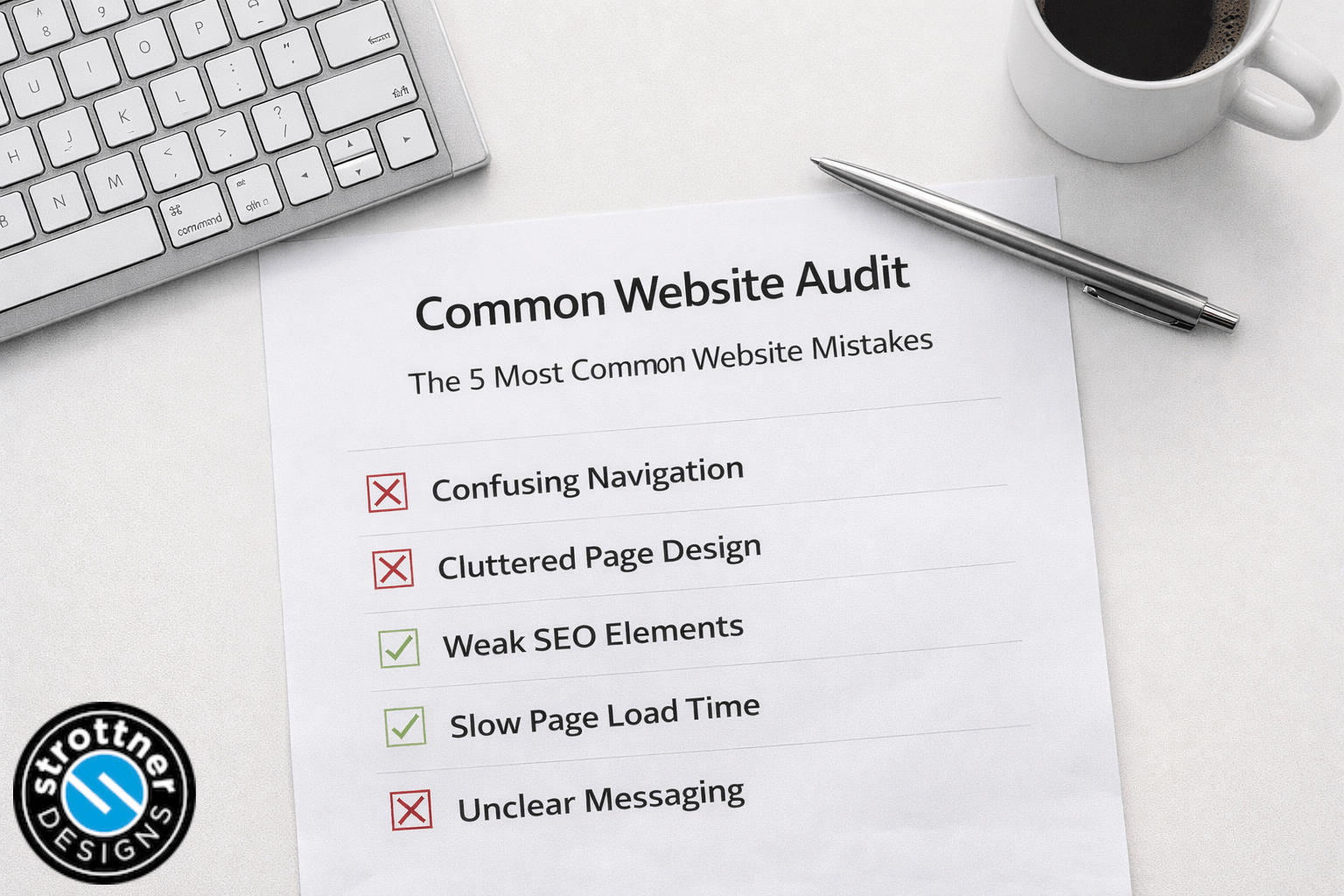
If any of the above warning signs sound familiar – confusing navigation, no clear CTA, slow/mobile-unfriendly design, outdated looks, or weak messaging – it’s time to act. Your website might be silently bleeding leads, but the fix starts with awareness. Take a fresh look through the lens of these checks and note down what stands out.
At Strottner Designs, we help businesses pinpoint exactly these issues. Think of our team as your tech-savvy contractors: we can rebuild or update your site so it functions like the salesperson it should be. Whether it’s a faster, responsive design; a clearer brand and logo; content that converts; or integration of SEO so people actually find you, we cover it all.
Ready to turn your website into a lead-generating machine? Book a consultation with Strottner Designs today and let us perform a professional website audit. In this session, we’ll review your site (visually and technically), identify problem areas, and map out a plan to boost your leads. Don’t let another prospective customer slip away. Click here to schedule your free consultation and start converting more visitors into customers!
![]()
Interested in a new site and SEO, or just a new site? Visit Home of the Free Website to learn how we can build you a free or affordable site.
Privacy Policy | Sitemap | Terms of Use