
 When building a brand, one of the most critical visual decisions you’ll make is how to represent your business through a logo. But before diving into design, it’s essential to understand the two primary components of a logo: the logotype and the logomark. Though they often work together, each serves a distinct purpose – and knowing the difference can help you craft a more effective and memorable brand identity.
![]()
A logotype, also known as a wordmark, is a logo that consists entirely of text – typically the name of the company or brand. Think of iconic examples like Google, Coca-Cola, or Visa. These brands rely on typography, spacing, and color to create a recognizable identity without any accompanying symbol.
• Typography-focused: The font choice plays a huge role in conveying the brand’s personality.
• Name recognition: Ideal for new businesses that want to build name awareness.
• Simplicity and clarity: Easy to read and reproduce across various media.
• Strong brand name visibility
• Easier to trademark and protect legally
• Works well across digital and print formats
• Less visual impact without a symbol
• Can be harder to scale down for small applications (e.g., favicons)
![]()
A logomark is a symbol or icon that represents a brand without text. It’s often abstract, illustrative, or geometric, and it aims to evoke emotion, meaning, or recognition through imagery. Famous examples include Apple’s apple, Nike’s swoosh, and Twitter’s bird.
• Symbolic representation: Often designed to reflect brand values or industry.
• Versatile usage: Can be used as app icons, social media avatars, or product stamps.
• Memorability: A strong logomark can become instantly recognizable.
• Highly scalable and flexible
• Visually striking and memorable
• Ideal for global brands or multilingual audiences
• May require time to build recognition
• Can be ambiguous without accompanying text
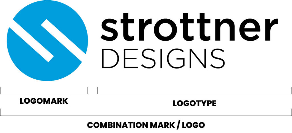
![]()
Many brands, Like Strottner Designs, opt for a combination mark, which includes both a logotype and a logomark. This hybrid approach offers the best of both worlds: the clarity of a name and the visual punch of a symbol. Over time, as brand recognition grows, companies may choose to use the logomark independently – like Starbucks or McDonald’s.
• You’re launching a new brand and want to build both name and visual recognition.
• You need flexibility across different platforms and formats.
• You want to future-proof your brand for potential evolution.
Choosing between a logotype and a logomark depends on your brand’s goals, audience, and context. Here are a few guiding questions:
• Is your brand name unique and memorable on its own? If yes, a logotype might be enough.
• Do you want a symbol that can stand alone in digital spaces? Consider a logomark.
• Are you building a brand that needs to be recognizable across languages or cultures? A logomark can transcend linguistic barriers.
• Do you want flexibility and room to evolve? A combination mark offers adaptability.
Your logo is more than just a pretty graphic – it’s the face of your brand. Whether you choose a logotype, a logomark, or a combination of both, the key is consistency, clarity, and alignment with your brand’s personality. A well-designed logo builds trust, communicates values, and leaves a lasting impression.
So, contact Strottner Designs today to discuss your logo needs and for us to help you make a decision if a logotype, logomark, or a combination mark is best for you and your business. Your logo isn’t just how people recognize you – it’s how they remember you.
* Disclaimer: Strottner Designs, LLC did not design the logos in this article other than our own Strottner Designs logo. These logos are presented for reference only to explain the difference between the types of logos.
Privacy Policy | Sitemap | Terms of Use