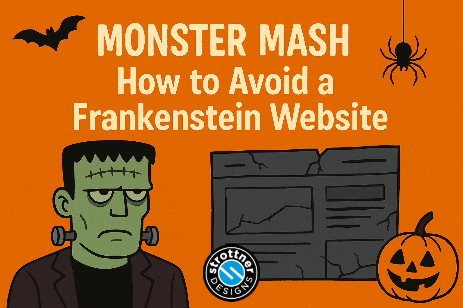
 Halloween’s creeping up again. Pumpkins on porches, fake cobwebs on every corner, and somewhere out there, a business owner is staring at their website in horror. The lights flicker, the homepage groans, and a collection of mismatched plugins begins to twitch.
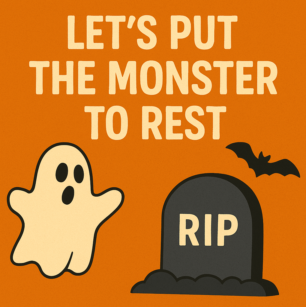
They’ve created a monster.
You know the type. A homepage stitched from three different design styles. A WordPress theme barely hanging together. Plugins fighting like ghouls in the night. It’s alive, but just barely. We call it the Franken-site.
And here’s the thing: most Franken-sites are born with good intentions. A quick fix here, a “temporary” plugin there. Before long, your site’s lurching across the internet, terrifying your customers and making your analytics scream.
At Strottner Designs, we’ve seen our fair share of digital creatures. The good news? Every monster can be redeemed. You just need the right team, a little bit of science, and zero lightning bolts.
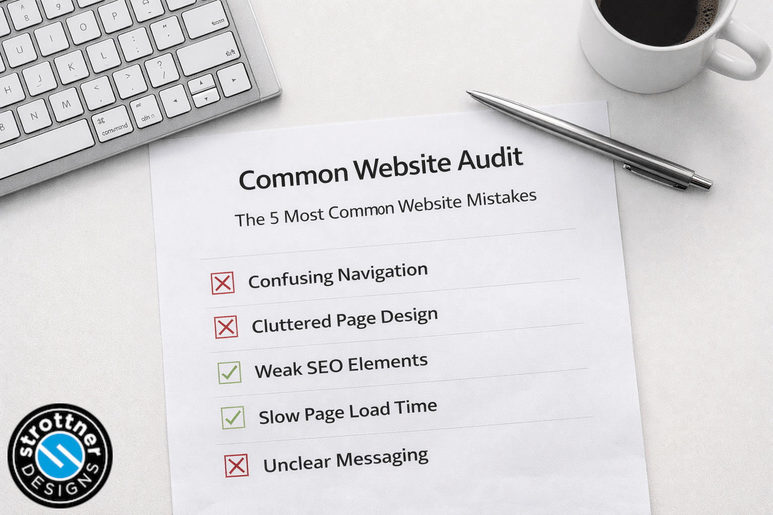
Let’s pull back the sheet and see what’s inside. A Franken-site usually shows a few unmistakable symptoms:
Most of the time, this happens gradually. A small business grows, new people jump in, the site gets “updated” over the years, and before you know it, you’ve got a digital patchwork quilt. Except less cozy and more chaotic.
Nobody sets out to build a Franken-site. It sneaks up on you. A developer leaves, someone new steps in with a different toolkit, and a plugin that was “temporary” ends up staying forever.
A few of the usual culprits:
Each little tweak feels harmless, but over time, it’s like adding too many spare parts to one body. Eventually, the whole thing starts groaning under its own weight.
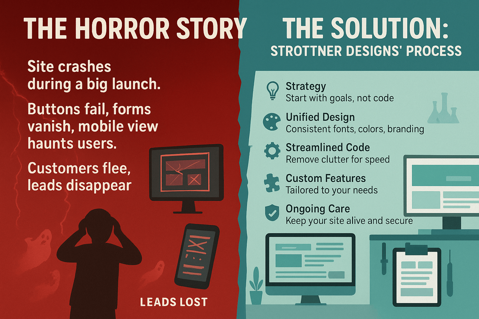
Imagine this. You’re launching a big seasonal promotion. You’ve got ads running, emails queued, the works. You hit “publish,” and suddenly your site breaks. Buttons stop working. The contact form disappears. Your mobile view looks like a haunted maze.
You stare at your screen, whispering, “What happened?”
That’s the moment the monster turns on its creator. It’s alive, yes, but it’s not listening to you anymore. Your customers click away, your leads vanish, and all that excitement curdles into panic.
We’ve rescued clients from that exact nightmare. They come to us with sites that won’t cooperate, designs that crash when you breathe on them, and pages that refuse to load unless the moon’s in the right phase. The problem isn’t bad luck. It’s bad architecture.
When a Franken-site stumbles into our lab, we don’t just throw on a new coat of paint. We rebuild it with intention. Every piece gets reconnected to a clear goal, so your site stops feeling like a monster and starts feeling like a living, breathing part of your business.
Here’s how we do it.
We start with discovery, not design. Before we touch a line of code, we dig into your goals, your audience, and your growth plans. That’s how we make sure your site actually supports your business instead of just looking pretty.
A great website doesn’t feel like a bunch of pages—it feels like one consistent experience. Fonts, colors, and layout all align with your brand personality. Every click feels intentional, not accidental. Visitors shouldn’t notice the design; they should feel guided by it.
We strip away the clutter: redundant plugins, bloated code, outdated tools. You’d be amazed how fast a site runs once we clear out the cobwebs. Clean code means fewer bugs, faster loading, and a smoother experience across devices.
Templates have their place, but we don’t believe in cookie-cutter solutions. When you need custom features, we build them with precision so they actually fit your workflow. The goal isn’t to impress developers—it’s to make your life easier.
Even the best-built sites need upkeep. We offer long-term support and maintenance to keep everything secure and running like new. Think of us as your digital groundskeepers, making sure your website never drifts back into the graveyard.
A clean, cohesive site doesn’t just look better—it performs better.
It’s the difference between driving a custom-tuned car and trying to steer a junkyard mash-up. Both might technically run, but only one gets you where you’re going without breaking down.
I know the idea of a full website overhaul sounds scary. But trust me, it’s not as bad as you think. The worst part is the waiting, the dread of not knowing what’s wrong. Once we start, you’ll see progress fast. We’ll walk you through every stage so you always know what’s happening and why.
By the time we’re done, your site won’t just look modern. It’ll work like a well-oiled machine. And you’ll finally be proud to send people to it instead of apologizing for it. We think this is so important that we’ve created multiple programs to make it easier for you to say “Yes!” to the redesign.
Your website shouldn’t be a source of stress. It should be your best salesperson, working 24/7 without complaint. At Strottner Designs, we build sites that are alive in the right way—vibrant, intelligent, and fully under your control.
If your website’s looking a little stitched together lately, don’t wait for the next full moon. Reach out to us. We’ll help you rebuild it from the inside out, piece by piece, until it’s something you can be proud of again.
This Halloween, skip the scare. Let’s make something that lasts.
![]()
Interested in a new site and SEO, or just a new site? Visit Home of the Free Website to learn how we can build you a free or affordable site.
Privacy Policy | Sitemap | Terms of Use